C A S E S T U D Y

ENHANCING THE DELTA MOBILE EXPERIENCE.


(Psst. In a hurry? Jump to any part of my design process above!)

THE DESIGN CHALLENGE
My team was tasked with a way to make Delta's in-flight services and entertainment available to passengers on their mobile devices through the existing Fly Delta app.
THE PROJECT
TOOLS
Sketch, InVision, Illustrator, 99 Post-its
DELIVERABLES
Clickable prototype
TEAM
Melissa, Phillip, Carlos
SPEC CLIENT
Delta
TARGET DEVICE
Mobile application
SPRINT DURATION
Two weeks
MY ROLE
stuff i did
- Research the business culture and goals
- Conduct a comparative analysis
- Evaluate the current Fly Delta App
- Run user interviews
- Synthesize the data
- Ideate customer journey
- Sketch screens and wireframe
- Conduct usability testing
- Create clickable prototype
- Annotate screens
- Iterate, iterate, iterate
- Bought a lot of post-it notes


ABOUT THE COMPANY
Delta is already known for its catchy slogans and good customer service, so when we went set out to research its background, we had no idea it was actually the second most profitable airline in the world. Delta serves more than 180 million customers each year, offering them more than 15,000
flights just daily!
One of the five remaining legacy carriers, Delta is the sixth-oldest operating airline by foundation date, and the oldest airline still operating in the United States.

In 2013, Delta Air Lines was the world's largest airline in terms of scheduled passengers carried (120.6 million), and the second-largest in terms of both revenue passenger-kilometers flown (277.6 billion) and capacity (4.4 billion). Researching these numbers and more of its history provided us with insights into the general culture surrounding the airline, and also helped us to better define both our user and business goals.
We didn’t want to create an experience for just our user; we wanted to design something that would take Delta’s needs into account alongside the passenger’s.
Through more of our research, I also discovered that in-flight entertainment isn’t just important, it’s necessary. Delta relies on their media offerings not only to foster brand loyalty, but also to serve a more practical need: distracting tightly packed economy-class passengers.
“Our inflight entertainment is exactly for that purpose -- it keeps the customers occupied and in their seats. It’s incredibly useful, and the longer the flight gets, the more useful it is.”
Our task of finding a way to offer passengers in-flight services on their own devices now had a solid direction, and a purpose. We were ready to move on to the next steps.
COMPARATIVE ANALYSIS
I downloaded about 15 different mobile apps to conduct a comparative analysis for our proposed app solution: I chose mostly airlines but also ventured into entertainment and streaming services. We wanted to combine the best of both worlds, so we needed to research them both.

TASK ANALYSIS
I then performed a task analysis for the three companies I decided to focus on in order to determine how easy and intuitive it was to partake in enjoying entertainment streaming. Below, I've included a couple of screen recordings of the Virgin flight app and the Netflix app.
THE TAKEAWAYS
I found that many airlines had similarly structured mobile content and layout, but that none offered their inflight services and entertainment in one app. Most offered an experience where the user would need to download a separate, unrelated app (such as Gogo) whereas some didn’t offer any at all.
Only Virgin America and Turkish airlines had a separate app for their inflight entertainment, but each provided very little in the way of options and control. Plus, the layouts themselves were quite lacking: surprisingly, none of them matched the fantastic aesthetic usually present in an airline such as Virgin.
DISCOVER & DEFINE THROUGH USER RESEARCH
Our team set out to interview six users, ranging from age 25 to 38, who all answered our initial screenings inquiring about their flight habits.
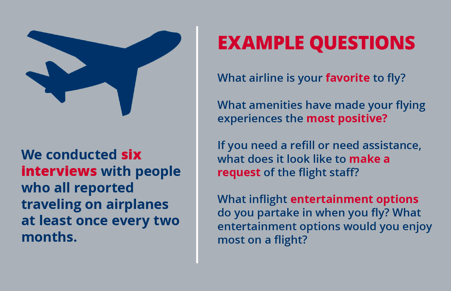
We came up with about 28 base questions for a jumping off point, and compiled each of our answers onto corresponding post-it notes: a color for each participant.
After much deliberation, our team used various methodologies to organize our user findings into the following categories:
- People expect free amenities on flights
- People experience complications when paying for wifi and food
- How often people fly
- Flight info app usage
- People want more food and entertainment options
- Reasons why people choose to fly their preferred airlines
- Personal device preferences
- Discomfort with flagging a flight attendant
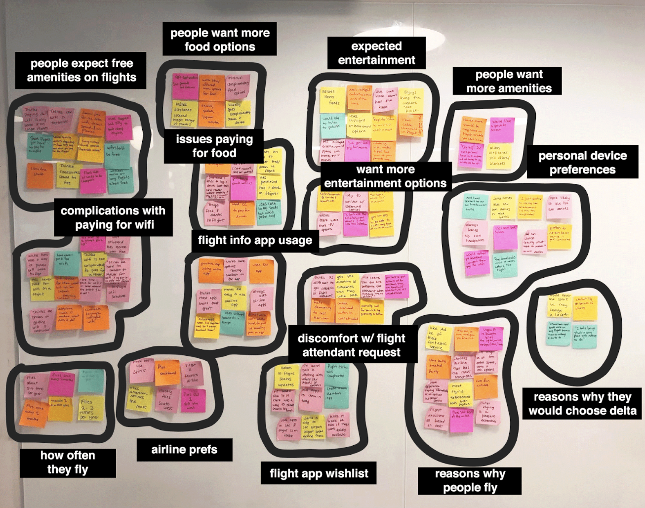
Affinity mapping our user interviews takeaways.
INTERVIEW TAKEAWAYS
Now came the meat and potatoes of defining the direction of our app: our team spent a full day synthesizing the data from these user interviews: identifying pain points, common desires, probable solutions and preferences.

“I don’t like to use inflight entertainment because I usually don’t like the selection. And why do I still have to pay for wifi? It’s 2018.”
We found the following trends in our research:
- Users want more of a variety of food and entertainment options
and will bring their own devices because of this - Users are typically uncomfortable or frustrated with flagging
down a flight attendant - Users tend to experience several issues paying for wifi and entertainment onboard
- Users expect and desire free amenities inflight to offset the
cost of flying

CUSTOMER JOURNEY: CREATING THE PERSONA
After we had some sense of what the central problems and desires were, we decided to really probe into our users’ minds by mapping out a potential customer journey. This allowed us to further identify pain points and pleasurable moments our user would experience using our app before, during and after a flight.

We created a customer journey for our primary persona, Jen.
The proto-personas our team brainstormed prior to our research eventually paved the way to two informed personas: Jen, the occasional traveler in a long-distance relationship, and Luis, the frequent business traveler.
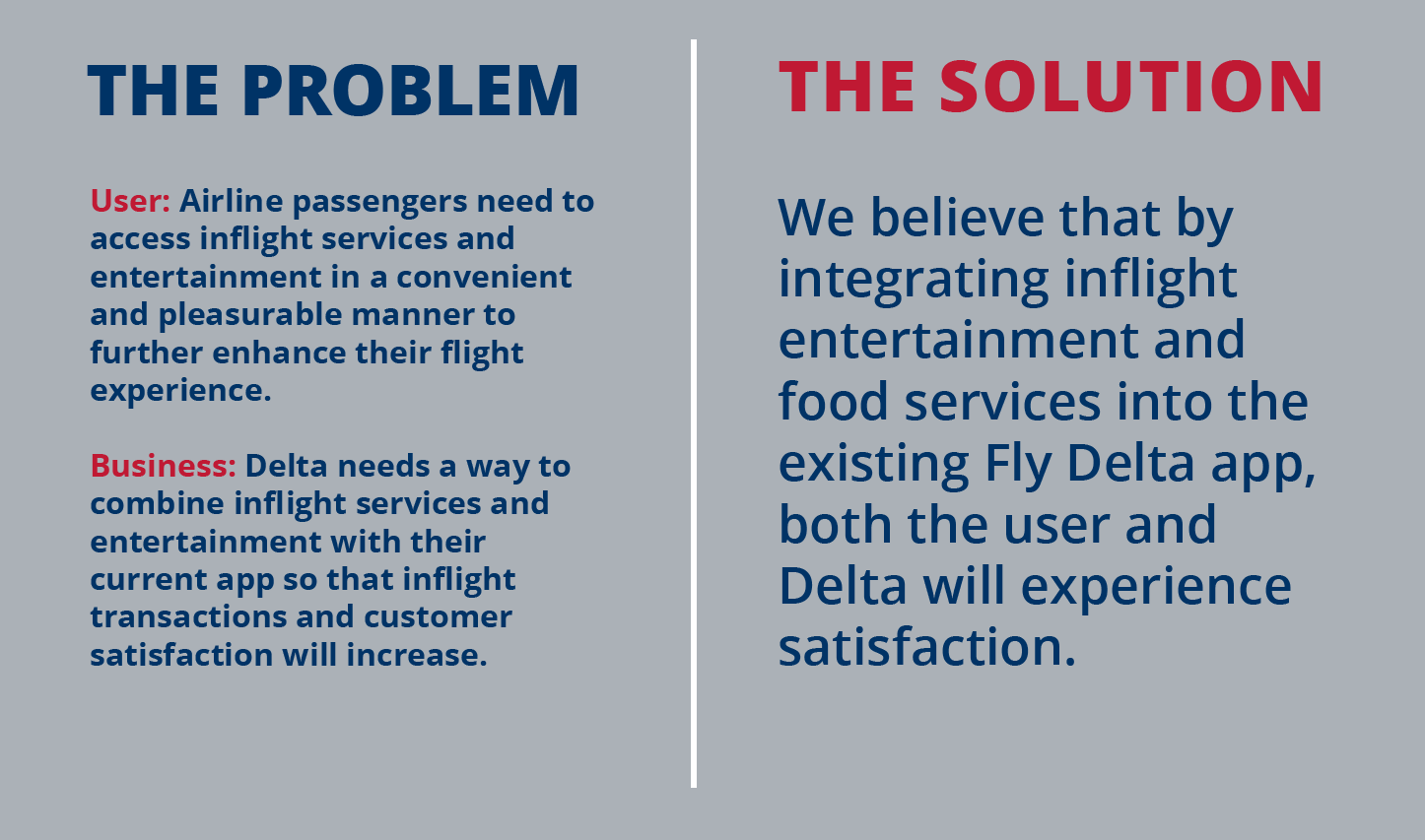
THE PROBLEM & SOLUTION
Now that we had a strong idea of who our user was, it was time to use our data to come up with a concise and defined problem and solution that would satisfy what was missing for our user’s flight experience, and pair it with a goal Delta wanted to meet.
The solution in question? We believe that by integrating inflight entertainment and food services into the existing Delta app, both the user and Delta will experience satisfaction.
We aimed to remove the pain point of having to download two separate apps, and thus combine what Delta wanted to offer in a simple, intuitive interface that was quickly accessible from the existing Fly Delta app.
FEATURE PRIORITIZATION
Defining the backbone: having a clear direction of our proposed solution led our team to brainstorm on ideas for features we wanted to include in our app.

We used the MOSCOW method to decide on the app's features.
We each spent time coming up with as many as we could on our own, and then used the Must-have, Should-have, Could-have, Won't-have (MOSCOW) method to pair them down and focus on the must and should have’s. The must, should, could and won’t have’s were all color-coded via post-it note, and further organized into categories.
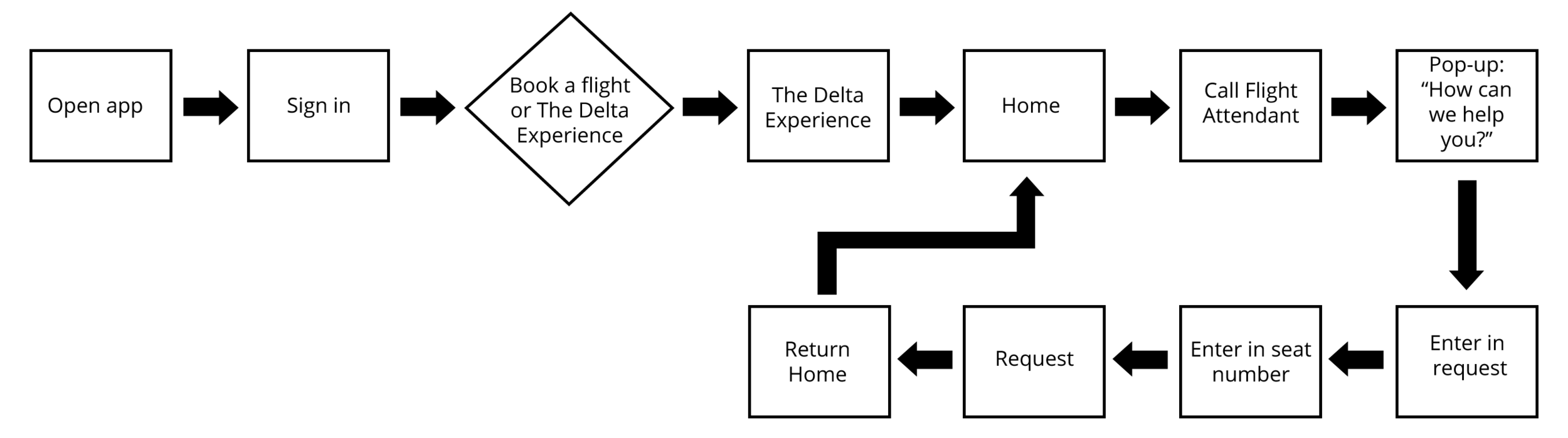
From there, we created a couple of basic user flows for two happy paths our user Jen would take: order a drink and choose a tv show to watch inflight.
The First Happy Path (Existing User): Request from flight attendant
The Second Happy Path (Existing User): Watch an episode of Star Trek

And Now: The Sitemap
At this point, our team had a pretty solid idea of how the app would run, and what kinds of features we wanted to include in it. Which brings us to our next step: creating our app's sitemap!


DESIGN STUDIO & SKETCHING
Now came the fun part: ideating and sketching! Our team took a couple of days using The Design Studio methodology to brainstorm on what exactly our app would look like. We each came up with several low-fi sketches that we eventually whittled down into some solid frameworks for what we wanted.
Some of our initial design studio sketches.
WIREFRAMING
From there, we further fleshed out our ideas with some wireframes and initial high-fidelity designs in Sketch. We each tackled a path: I created the initial design and aesthetic for the app, the icons, and the screens pertaining to home, flight details, and calling an attendant.
I also developed a style guide from researching existing Delta components that we then used to design our high-fidelity screens. We focused on the three main colors Delta used, with a heavy emphasis on the blues so that we could create a sense of calm. After all, flying is a scary endeavor in itself, we want our users entertained AND calm!
I developed the initial wireframes and first iterations.
The second iteration refined the flight details page.
We then imported the screens into InVision and were ready to have users test them out!

USABILITY TESTING
Now that we had a clickable prototype, we were ready to have users interact with it. We each set out to test two users between the ages of 24-36. We planned on the following scenarios:
- Imagine that you’re thirsty and would like to order a single drink
- You want to catch up on the latest episode from your favorite TV show (in this scenario, the users favorite TV show was Star Trek--as it should be!)
- You’re cold and want to ask the flight attendant for a blanket

KEY FINDINGS
- Four out of six users experienced confusion when trying to order a blanket and flag down a flight attendant--the icons for doing so were not clear to them
- Five out of six users could understand the path for ordering food and a tv show
- Two out of six users could not make out what the progress bar was in the flight details
- Three out of six users thought the flow of the app seemed different section by section--the design did not feel cohesive enough to them
- Five out of six users found the ordering process simple and intuitive
FURTHER ITERATING & ANNOTATIONS
Our testing led us each to make many changes through the wireframes, solving as many issues as we thought seemed important in our designs. After a few more iterations of this, I took the lead and made sure that our entire design was cohesive and flowed more naturally.
My most recent iterations of my designs included fixing the progress bar, adding a few screens for the flight attendant, and showing further interaction with the map and more.
Because some of our user testing feedback mentioned inconsistency in our design, I decided to iterate even further on my own and developed one of our other happy paths to match my initial designs for the first 12 screens.
I conducted more user testing of my version of this happy path and discovered that users felt the app felt more cohesive and "real" to them. Success?

Below is a detailed annotated view of one of my screens that includes the functionality, design elements, typeface and more.

View the prototype in action below!


OVERVIEW
Our team felt satisfied that we designed a delightful solution to problems both the user and Delta were facing. The additional interface to the existing app would create ease and convenience for the customer and would increase overall transactions with Delta.
WHAT WENT WELL
The planning and ideating went really well in our project, as well as the timeliness of our deliverables. We used a Trello board to organize our team efforts and took time in the beginning to get to know each other's strengths and weaknesses. This paid off big-time when it came time to divvy up the tasks.
WHAT I LEARNED
During this project, I was able to really explore how much a user's needs aligned with a business' and use that information to design an experience that would benefit them both. Taking the time to extensively research into Delta and it's competitors allowed me to really see what was missing, and what was the most important.
Since our team was working remotely during a third of the project, I learned that it was really important to have an interactive organization board and slack channel so that communication was fast, and tasks were clearly outlined. It was also crucial that we created a cloud storage system for all of our files so that any one of us could have access to each other's research and deliverables at all times.
Working with a team was both exciting and, at times, a bit frustrating. The division of workload was a bit unbalanced and created some inconsistency within the end results of our screens. Because of this, I then went beyond the scope of the project to further develop and fine-tune some user paths that I felt fit more in line with the vision we originally had in mind for the project. Overall, it provided a great learning experience in how to address concerns in these areas and how to manage a situation like this in the future.
NEXT STEPS
If we continued the project, we’d like to tackle the following next steps:
- Have an informational list of restaurants and shops in each airport gate
- Social media integrations
- Frequent traveler subscription service and discounts
