C A S E S T U D Y
A TECHNICAL APPLICATION FOR NUWASH
(Psst. In a hurry? Jump to any part of my design process above!)
THE DESIGN CHALLENGE
My team was tasked with the challenge of creating a technical application for the car wash techs and an accompanying administrative dashboard.
THE PROJECT
TOOLS
Sketch, InVision, Illustrator, 99 Post-its
DELIVERABLES
Clickable prototype, Admin Dash
TEAM
Melissa & Nick
CLIENT
NuWash
TARGET DEVICE
Mobile tech application
SPRINT DURATION
Three weeks
MY ROLE
stuff i did
- Research the business culture and goals
- Conduct a SWOT analysis
- Observed tech in the field
- Run user interviews
- Synthesize the data
- Ideate customer journey
- Sketch screens and wireframe
- Conduct usability testing
- Create clickable prototype
- Design admin dashboard
- Iterate, iterate, iterate
- Bought a lot of post-it notes
NuWash is a relatively new company that currently lacks an adequate system for communicating with their technicians. This also includes a system for the technicians while on the job. Their only solution for this so far? Slack. Although a great tool for communication, it's not ideal for conveying important information that could easily be overlooked when more than one person adds to the conversation.
Replacing the need for slack was our prime directive.
So, our team set up to explore and create a solution for this problem along with identifying other ones through user research. I'd buy that for a dollar!
ABOUT THE COMPANY
Our team conducted a variety of research when exploring the needs of what NuWash was looking for: comparative and competitive, market research, task analysis and a SWOT analysis. I first focused on researching the business itself and performing a heuristic evaluation of its existing website.
NuWash, a mobile car wash and detailing company, offers a service that was previously unheard of until recently. In a nutshell, it's a car wash that comes directly to you. Your office, your home--you name the place, NuWash comes directly to it, and washes your car while you go on about your day. It's convenient, fairly priced and unique.
Founded in 2016, NuWash employs over 50 technicians that all serve as independant contractors. They currently have two offices--one in Austin and one in Dallas with plans for expansion later on.
After some more research, I conducted a SWOT analysis of the Nuwash business in order to better understand our client, it's weaknesses and their technician.
A comprehensive understanding of this helped me further define what was lacking in their business model.
Below is a screenshot of their current website and the interface they use to communicate job information to their techs: Slack. As you can see, there's a lot of information and the display of it lacks, uh, a certain elegance.
COMPARATIVE ANALYSIS
Because NuWash currently does not have a technician facing app, we decided it was best that we explored websites and apps that have a similar on demand car washing service to identify opportunities and gaps in other services to adopt or avoid as we moved forward with our brainstorming and research.
TASK ANALYSIS
I then performed a task analysis for a technician-facing application that we were able to gain access to: HelloTech. It's a technician app for people who perform various technical duties. Not the same field, but it still gave me a good idea and some inspiration on how to tackle our yet-to-be designed app.
Check out the screen recording below:
THE TAKEAWAYS
I found that many mobile car wash companies offered the same range of services as well as options for eco-friendly products that NuWash did. However, NuWash offered services that continued into the night and on weekends, unlike its competitors.
NuWash also only currently has a website for booking washes, as its customer app is still in progress. However, their services are also the highest rated on yelp and otherwise--they are a local business fully committed to provided the highest quality service.
Viewing other technician-facing apps such as HelloTech and Favor allowed us to identify with the priorities these companies used in their interface as well as general layouts and pain points we hope to avoid.
DISCOVER & DEFINE THROUGH USER RESEARCH
Our team set out to interview five users, ranging from age 19 to 27, four of which were NuWash techs whose experience ranged from member since inception to recent additions and another user who was a tech for a different company.
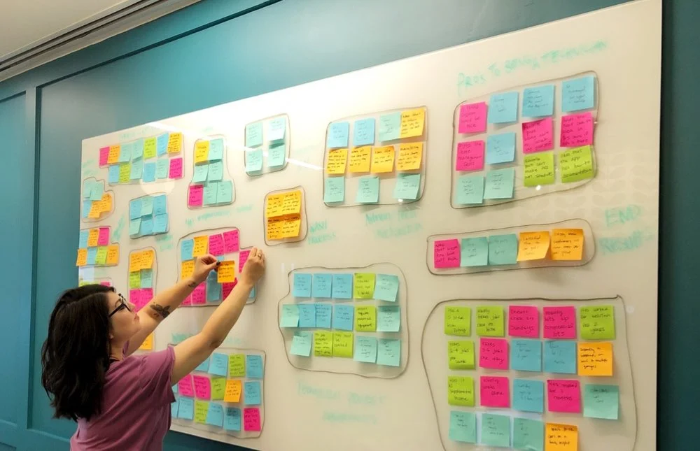
We came up with about 18 base questions for a jumping off point, and compiled each of our answers onto corresponding post-it notes: a color for each participant.
Our team used various methodologies to organize our user findings into the following categories:
- Workflow obstacles
- App improvement - admin
- App improvement - tech
- Communication
- Pros to being a tech
- Technician process requirements
- Demographics
- Wash Process
- Admin/Tech interaction
- Location issues
- Advice and tips
- Extraneous factors
INTERVIEW TAKEAWAYS
Our team spent a full day synthesizing the data from these user interviews: identifying pain points, common desires, probable solutions and preferences. Speaking with all the NuWash techs really gave us an inside perspective that was lacking in our initial research.
“The most annoying thing about a job is when a customer doesn't GIVE US their license plate number. I've washed the wrong car too many times to count!”
Our top five takeaways:
Missing information (eg, license plate) is the key pain point when identifying a car
Communication (both internally and externally) is vital for NuWash to be successful
Reviews can motivate technician performance
Keeping track of equipment would keep everyone organized and minimize loss and misplacement of items
A resource database would help technicians stay up to date and informed
CUSTOMER JOURNEY: CREATING THE PERSONA
We first created a user journey of a NuWash Technician’s current workflow without an app. This helped us glean more information about how a user would experience the process and what pain points we could further identify.
We then created a second user journey illustrating how our design would change (and improve!) the workflow of a NuWash Technician with a NuWash Technician app.
From our user finding takeaways and thinking through our user journey, we created this user persona as our primary persona in order to keep the NuWash technician in mind.
After all, while there were many stakeholders involved in our design process, the technician would be the end user.
FIELD OBSERVATION
Our design team decided to take our research a step further and conduct contextual inquiry with our users. In other words: we observed a NuWash technician while he was cleaning a client’s vehicle at a location to better understand the real world conditions and clarify some of our questions.
These observations prompted unique insights that were undiscovered from just the user interviews, and provided us with more answers to questions that were previously unclear.
The details:
Date: 7/13/18
Location: 9208 Waterford Centre
Tech: Gabriel Vondrak
THE PROBLEM & SOLUTION
Now that we had a strong idea of who our user was, it was time to use our data to come up with a defined problem and solution that would satisfy our technicians.
After speaking with stakeholders within NuWash our design team has defined the business problem as: NuWash needs an effective system to communicate information to technicians in the field, keep track of their equipment, and navigate scheduling and availability.
After conducting extensive research we defined our user problem as: technicians currently have a hard time identifying a car and need assistance in organization.
We want to design a technician-facing app that will enhance and complement the technician’s job, provide key information for identifying cars, assist in scheduling and provide an organizational tool for the administrative side.
We wanted the technicians to feel organized and relaxed. We don’t want them to have to think. We want them to enjoy a seamless experience, something they feel satisfied using on a daily basis. Something that doesn’t hinder their job, but complement it. Something that inspires and reminds them to perform at the quality they were vetted at.
This will be their most used app during their day job -- it should be easy, clear, intuitive, and pleasurable. After all, relaxed technicians make for relaxed customers.
FEATURE PRIORITIZATION
Defining the backbone: having a clear direction of our proposed solution led our team to brainstorm on ideas for features we wanted to include in our app.
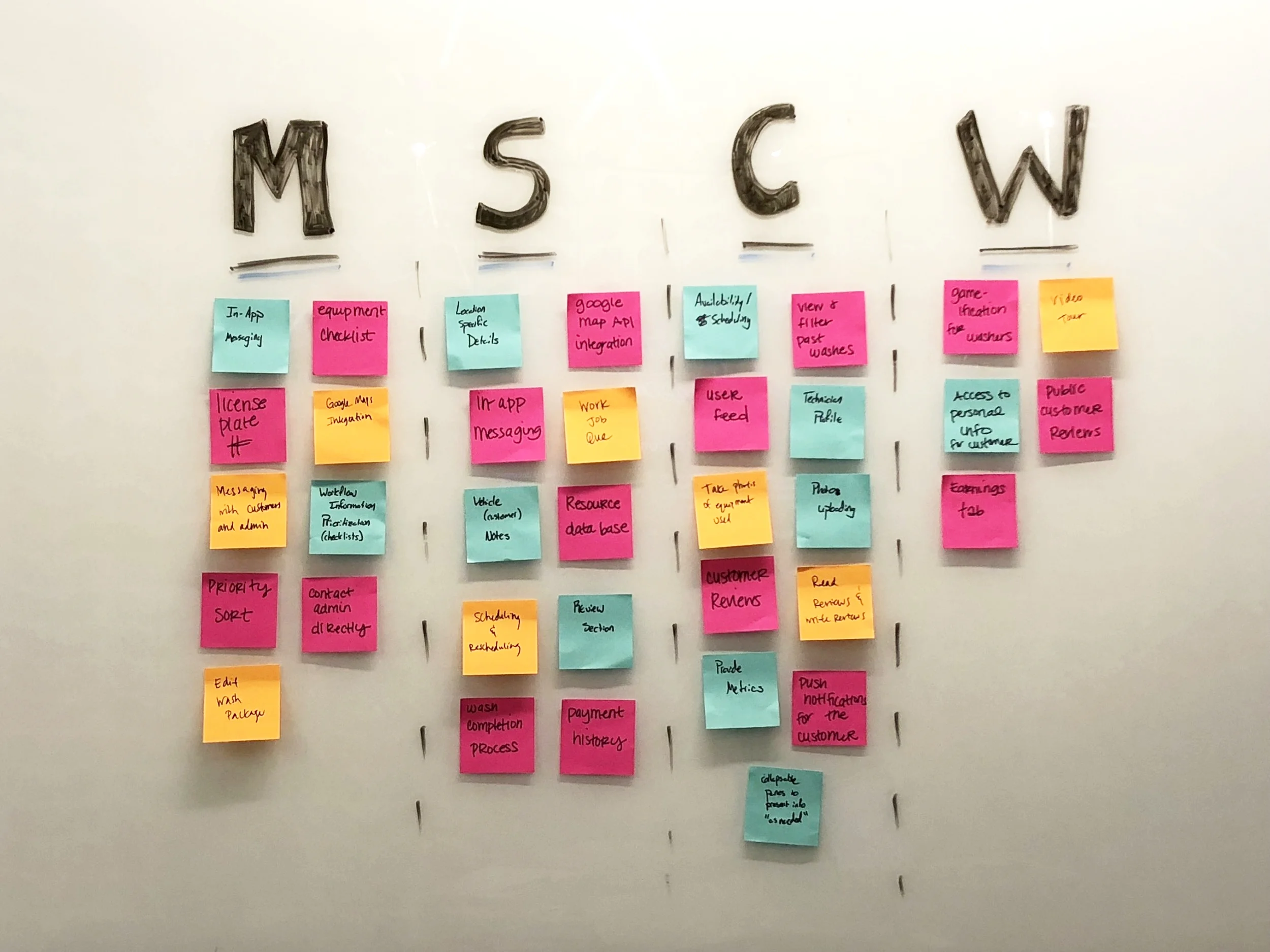
We used the MoSCoW method to decide on the app's features.
We each spent time coming up with as many as we could on our own, and then used the Must-have, Should-have, Could-have, Won't-have (MoSCoW) method to pair them down and focus on the must and should have’s. The must, should, could and won’t have’s were all color-coded via post-it note, and further organized into categories.
From there, I created a user flow for our user while on the job.
And Now: The Sitemap
At this point, our team had a pretty solid idea of how the app would run, and what kinds of features we wanted to include in it. Which brings us to our next step: creating our app's sitemap.
DESIGN STUDIO & SKETCHING
Now we were ready to move on to some analoging: ideating and sketching! Our team took a day using The Design Studio methodology to brainstorm on what exactly our app would look like. We each came up with several low-fi sketches that we eventually whittled down into some solid frameworks for what we wanted.
While we would be including several things in our design we realized that the main benefit we could provide to our users would be during their workflow. Each member of our design team sketched a version of this process and then we worked on combining elements of each design to most effectively benefit our user’s flow.
At the end of the day, we went with the majority of my designs and I was tasked with moving on to designing some medium-fidelity wireframes.


WIREFRAMING
We each spearheaded a section for fleshing out our screens further in medium-fidelity: I created the initial design and aesthetic for the app, designed all the icons, and all the screens pertaining to the home, washes, and earnings tab.
After many rounds of dicussion and some stakeholder feedback, we iterated a bit further before we decided to start our first round of user testing. We experimented with various screens for the welcome screen, changed the chat option to an inbox that would sync with FrontApp, and used icons in the notification section to assist in easy identifying.
Examples of four rounds of iterations, from low-fidelity to high-fidelity.
We then imported the screens into InVision and were ready to have our users test them out!
USABILITY TESTING
Now that we had a clickable prototype, we were ready to have users interact with it. We each set out to test three technicians with varying level of experiences. We planned on the following scenarios:
- Start your first wash for the day
- View your earnings for the second week of July
- Adjust your availability for August
Overall, all the technicians felt positively towards the general flow of the app (level up!) and experieneced excitement towards the look and feel.
KEY TAKEAWAYS
- Categorizing the notification feed would make it clearer
- Need to be clear on who is being contacted (admin/customer)
- Move the equipment checklist to after shift
- Notes for customer after wash is complete
- Availability choices were unclear to technician
ITERATING & STYLE TILES
After some more iterations, our team did a second round of user testing, but this time using the colors and typography that we designed for the brand.
We collaborated with the NuWash stakeholders using the Style Tiles method to develop and refine a visual style that would enhance the functionality experience for the technicians. There currently was no branding or style guide, so I set out to develop one for them based on their existing logo assets.
ADMIN DASHBOARD
Our team decided to further develop the synchronicty of our app with how it would communicate and relay information to and from an administrative side of things. I quickly sketched out and then designed a base dashboard for how this would look:
FURTHER ITERATING & ANNOTATIONS
Both rounds of our testing created new insights into how we would further flesh out some scenarios and solved as many issues as we thought seemed important. After a few more iterations of this, I took the lead and made sure that our entire design was cohesive and flowed more naturally.
My most recent iterations of my designs included fixing the progress bar, adding a few screens for the flight attendant, and showing further interaction with the map and more.
Check out my most recent prototype below!
OVERVIEW
Our team felt satisfied that we designed a useful solution to problems the NuWash technicians were facing. We believe that our design for the technician application will complement and address the technician’s needs while on the job, assist in time management, and provide a successful organizational tool for the administrative side.
WHAT WENT WELL
The execution and ideating went really well in our project, as well as our collective motivation. We set up an organized file management system and used a Trello board to organize our team efforts and deliverables. Our stakeholders were also really patient and open-minded, which provided room for more creativity.
WHAT I LEARNED
I learned that creating a technician-facing app was a lot different than one for a customer. There were so many new options and choices to consider that it felt like an entirely new (but enjoyable!) learning experience. Our target users were a different breed and designing the app felt like we were really making a difference in their lives. This project felt important--and necessary.
Unfortunately, we experienced a few road blocks that sometimes made completing the project on time tough. Sometimes the communication seemed lacking on our stakeholder side, which led to a lot of waiting games. Next time, I feel that laying a groundwork for set communication times would really help with this problem.
Working with a team was really beneficial and exciting at times, and of course a bit challenging in others. Especially when a member of the group was not physically present for the majority of the project and the work fell to the other two members. Additionally, I performed the majority of the design work, and while fun and challenging, it would be nice if other team members could contribute equally. Next time I will make sure to set a precedent early on that the workload should be more balanced! Overall, this also provided a good learning experience in how to address these concerns and how to manage a situation like this in the future.
NEXT STEPS
If we continued the project, we’d like to tackle the following next steps:
- Further usability testing
- Adapting for Android
- Syncing/interaction with the customer application
- Further cooperation with the development team


