Halo Reach Ui CONCEPT CASE STUDY
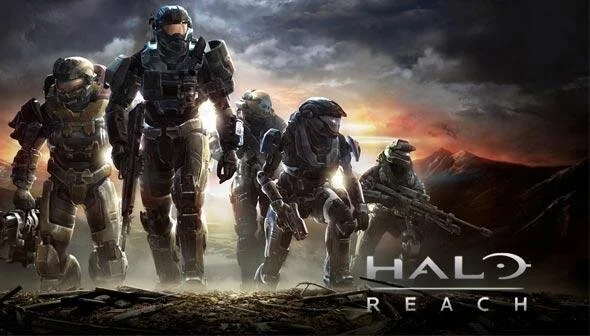
Before transitioning to working on Halo Infinite from working on an unannounced AAA title, our team opted to sharpen and test our UX and UI skills by tasking ourselves with a redesign of a game in the Master Chief collection. We were given free rein to choose any game and flow as well as visual identity. I decided on Halo Reach’s custom game selection menu because it presented the widest range of design opportunities.
Timeline: 3 weeks Tools: XD, Miro, Illustrator, Photoshop
01. Challenge.
Halo Reach’s current game-type menu design is cluttered, fails in displaying an intuitive visual hierarchy, and presents an unclear navigational direction. From a user perspective, it’s confusing and overly complex.
02. Problem
How can we reimagine a Halo Reach custom game menu that will provide a more intuitive, streamlined experience for both new and seasoned players? And how can we make it fun?
03. Goal.
Redesign a Halo Reach custom menu screen that:
Presents information in a concise, simplified hierarchy
Paves a clear roadmap for progression
Reduces cognitive load
Features a new visual identity
Feels intuitive and easily understandable
04. Milestones.
Research & User Flows
Wireframe Design Audit
Ideation & Brainstorming
High-Fidelity UI Screens
Milestone 01.
research & userflows
Our team first decided to run an initial audit on our chosen screens by creating both a player user flow and a task flow. We collaborated on a Miro board, where we were able to share our differences in how we approached designing our user flows as well as differentiating between those and task flows.
Creating the different flows allowed me to fully understand the current experience of the menu navigation and spot areas where I could improve upon.
milestone 02.
wireframe design audit
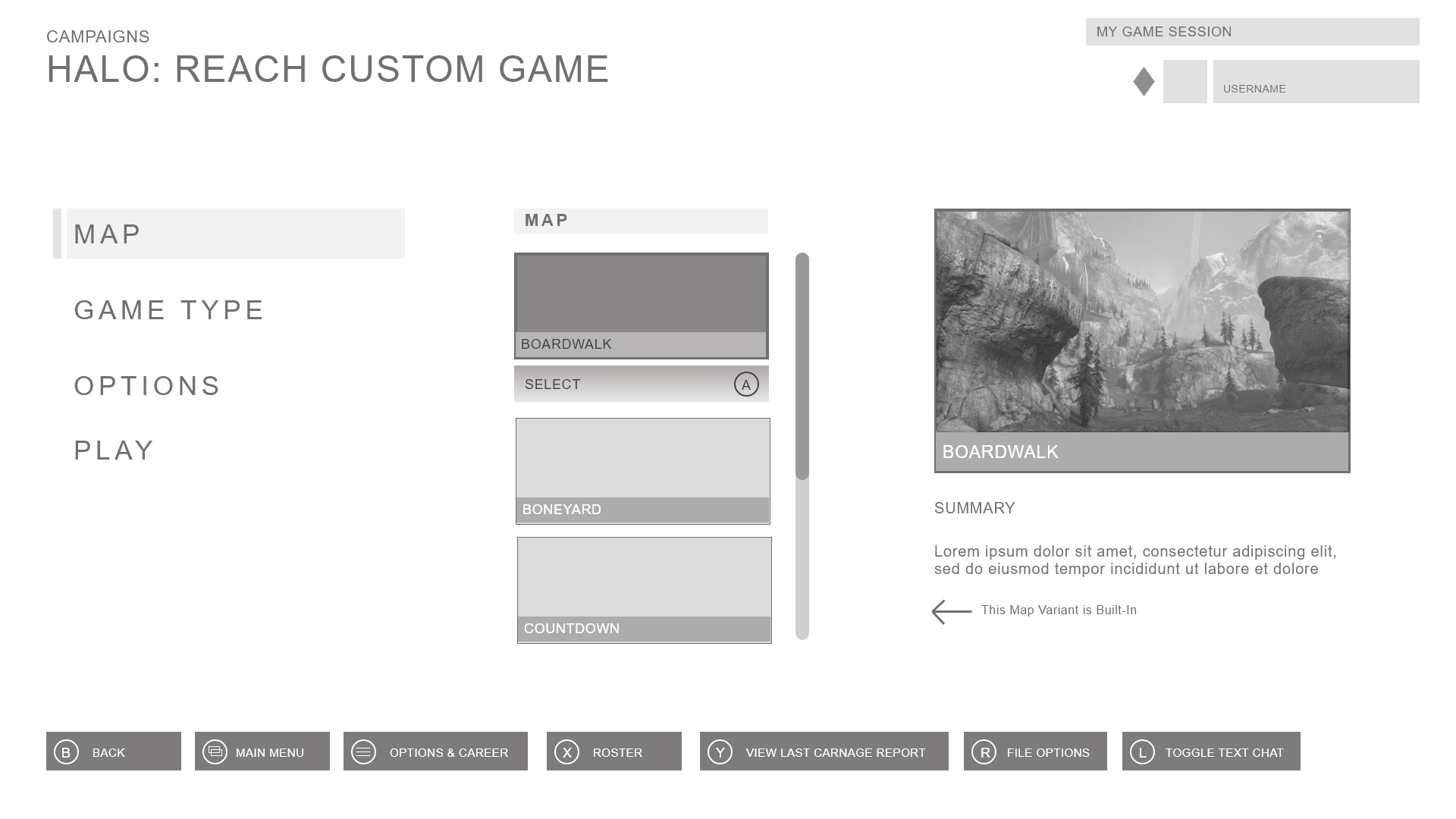
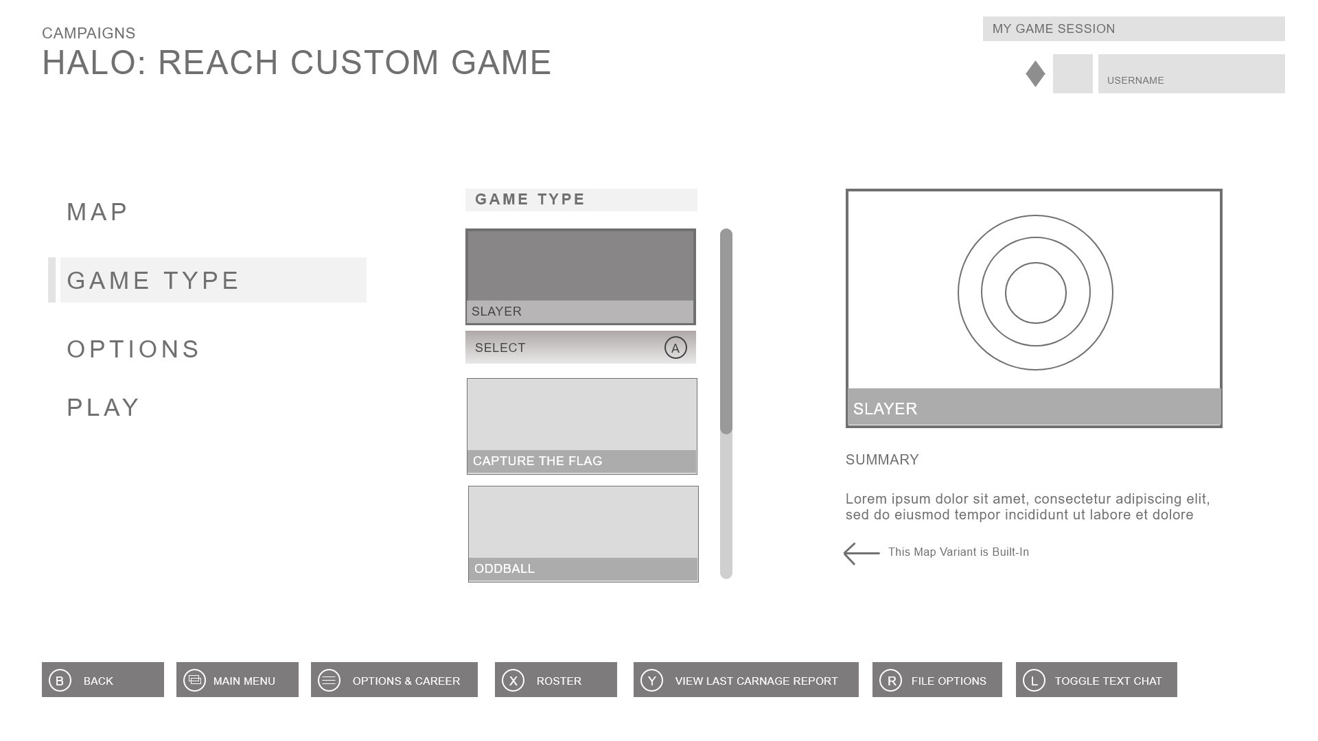
In the Master Chief Collection, the player is presented with a multitude of options for starting a game: campaign, multiplayer, and creating your own. From there, a player is then given the option to choose what type of multiplayer game they prefer and then finally, which game in the collection they’d like to play. It is quite the process, but very streamlined and neat—the exact opposite of what the custom menu options display.
For some extra wireframe practice, I proceeded to conduct an extensive wireframe audit and rapid prototyping of the exact flow I wanted to reimagine. This was incredibly helpful—I was able to discern areas and options I might have missed by just the user flows alone.
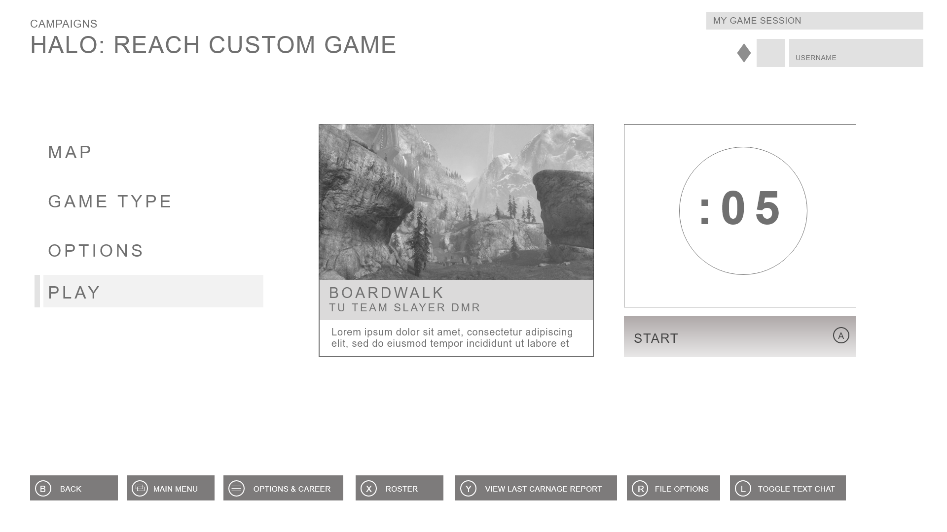
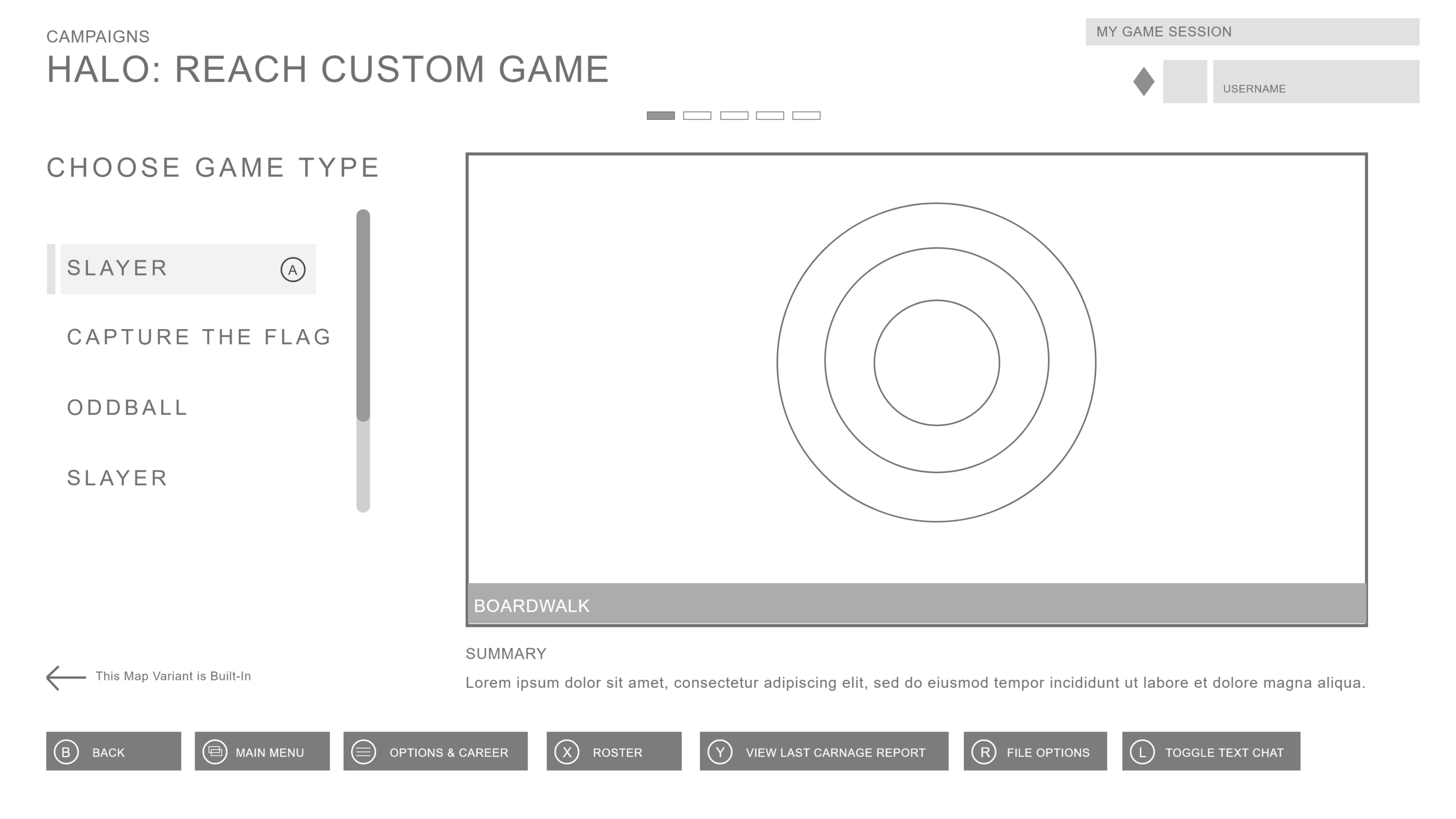
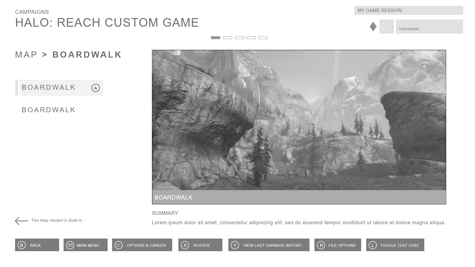
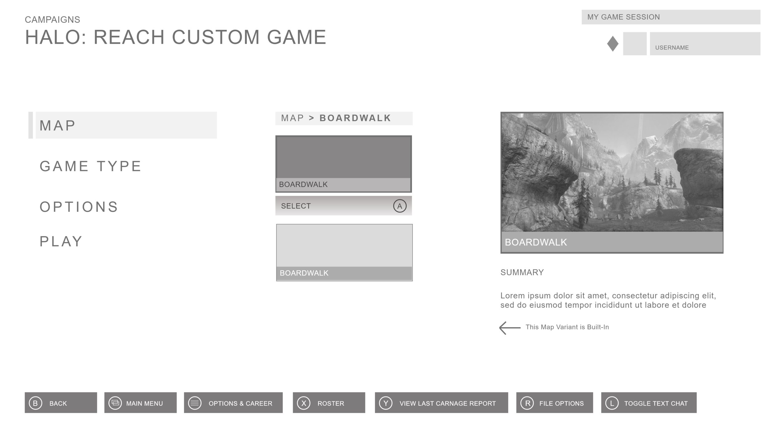
WIREFRAMES.

PROTOTYPE.
milestone 03.
ideation & brainstorming
I then began ideating on various designs that would reduce cognitive load, improve intuitive navigation, and still offer a customizable feel.
The current amount of customizations offered is vast, but a player could feel overwhelmed with options and how to navigate between them. I wanted to give players this same sense of agency over customization, but present the information in a more concise manner.


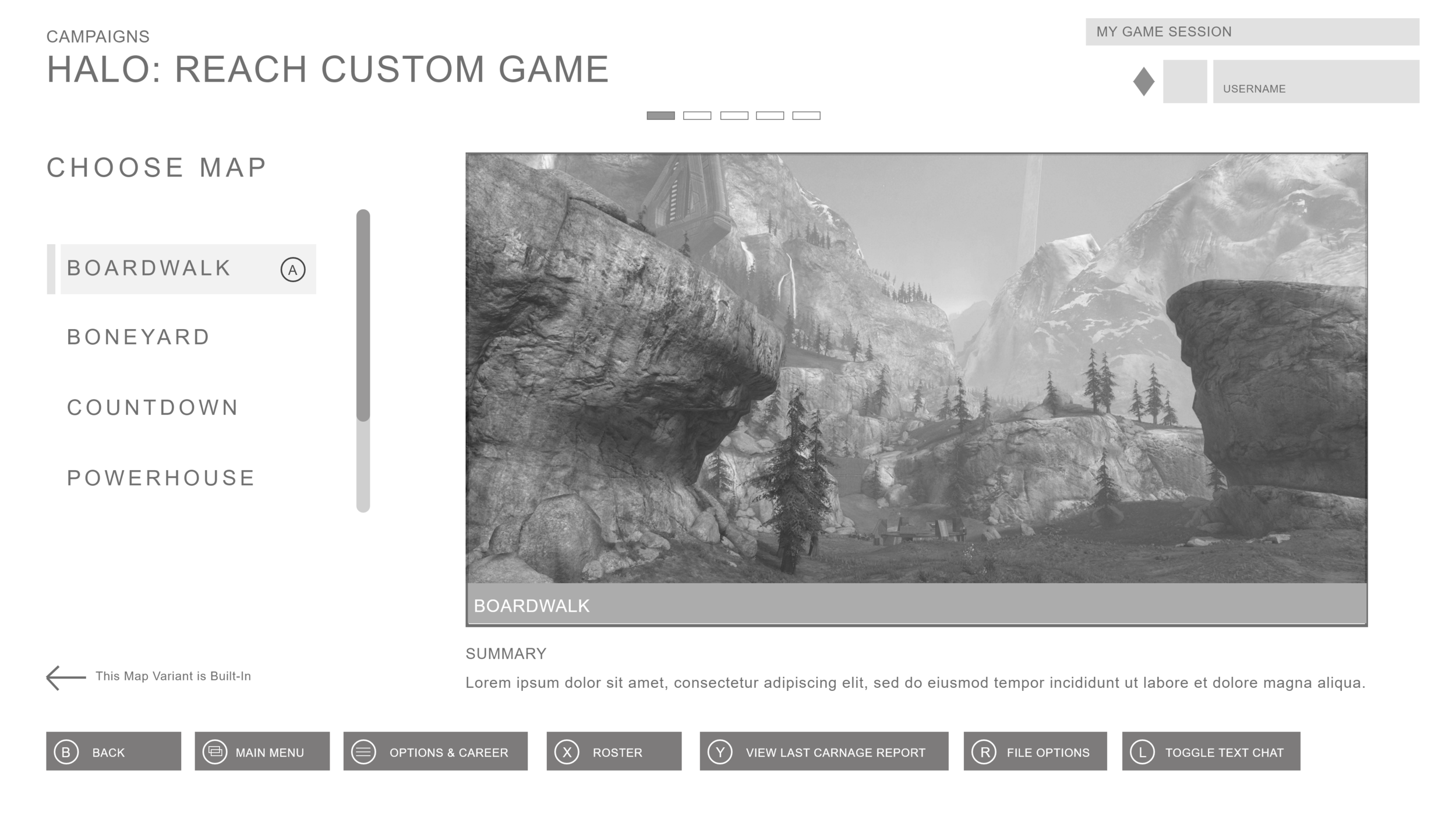

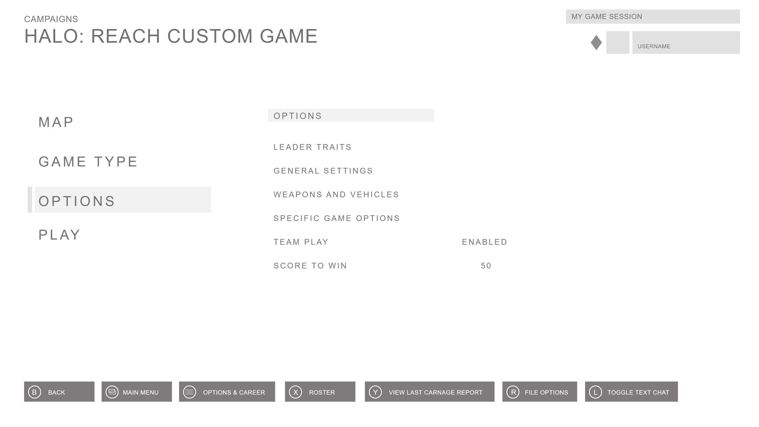

I tested out a few different paradigms, and ultimately decided on a image-heavy layout that had only the most essential information while still remaining visually pleasing.
I wanted to mirror how choosing a type and game worked in the initial menus, simplifying the visual array of choices a player has at customizing into multiple sub-menus as opposed to having everything all on one screen.
milestone 04.
high-fidelity ui screens
After reaching a design decision, I started mocking up high-fidelity screens in a variety of different visual styles, using background art from 343 Industries. I started with a palette similar to existing ones across the Halo franchise but quickly came to the conclusion that I wanted to try something different. We were given free reign, so I was going to take full advantage of it.

Being a child of the 80s who is still quite in love with them, I decided to go all in on a neon, retro-futuristic, tech-noir aesthetic. This Halo Reach belongs in a cyberpunk night city above the streets of Tokyo. This design still accomplishes my goals of reducing the cognitive load and paving a clear road for navigational progress in an intuitive user flow , while offering a fresh new visual style.
Find the final versions below:


