A TOUR OF SOME OF THE PROJECTS I’ve WORKed ON AT HOTSCHEDULES
ABOUT THE BUSINESS
HotSchedules is currently the number one scheduling and labor app on iTunes and has been in the business for well over 20 years: they serve over 3 million users in 173,000 locations across 61 countries. Their supply chain, human resource outsourcing, and workforce management solutions have paired with the industry’s most complete data and analytics suite to give users the actionable insights they need to control costs, scale profitability, improve employee engagement, and maintain compliance.
Working with a company who has this strong of a legacy was pretty exciting! As the UX/UI designer, I got to solve the unique problem of designing intuitive, usable interfaces with new features and improve upon existing designs in an app used by millions.
Getting started
After acquainting myself with the history and design of the product, I began my experience by visiting customers in local restaurants so that I could shadow their users in real-time and get a good gauge of their experience and interactions. User research has become one of my favorite parts of the job; learning from real humans and how they engage with the software is both professionally and personally fulfilling.
I then conducted a thorough design audit of all the screens in the areas I would be working on. Here’s a selected slice of key inclusions from the artboards I mocked for the audit:
This allowed me to get familiar with the areas I’d be concentrating on as well as identify pain points and features that needed updates or UX passes.
I eventually turned my audit into a living document that I aimed to use as a way to keep our designs consistent and accountable across the team. It was also a great communication tool for sharing our progress with our product managers and dev team.
Here are a few shots the most recent document:
UX WORK
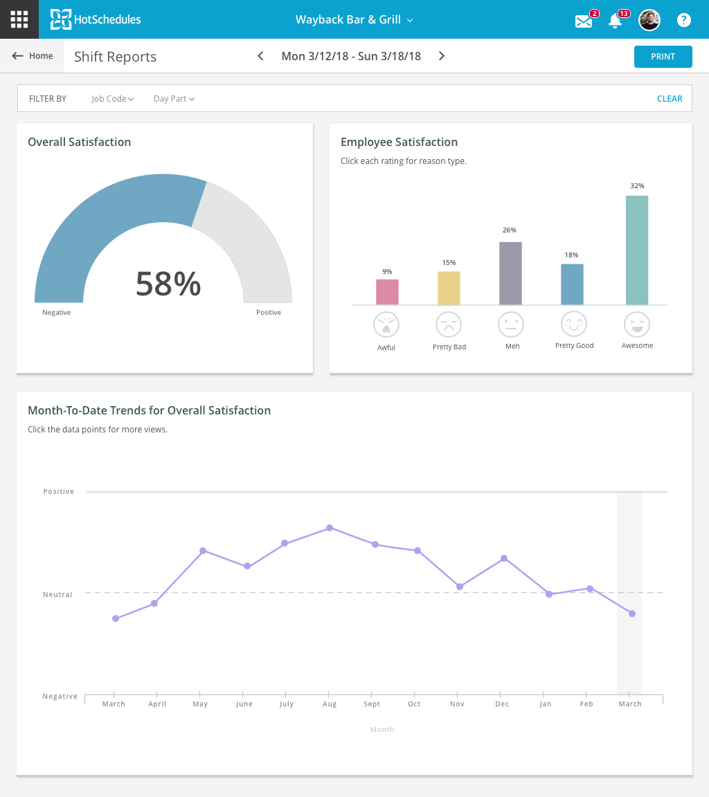
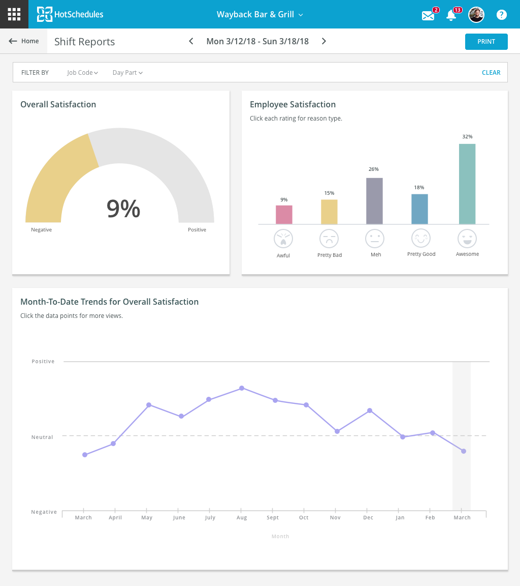
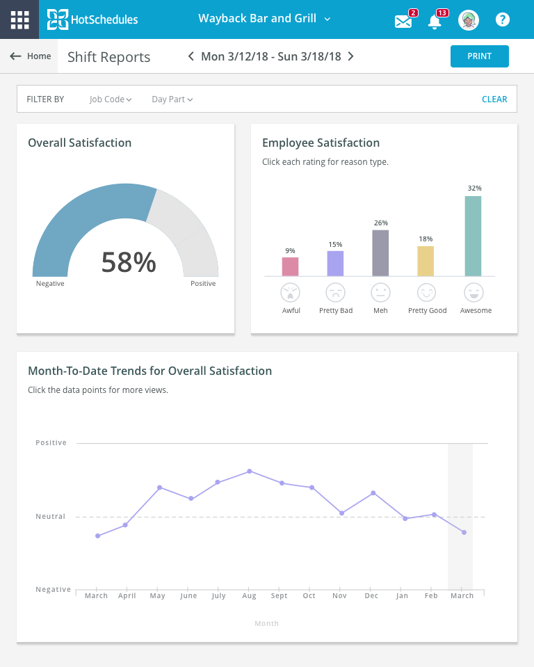
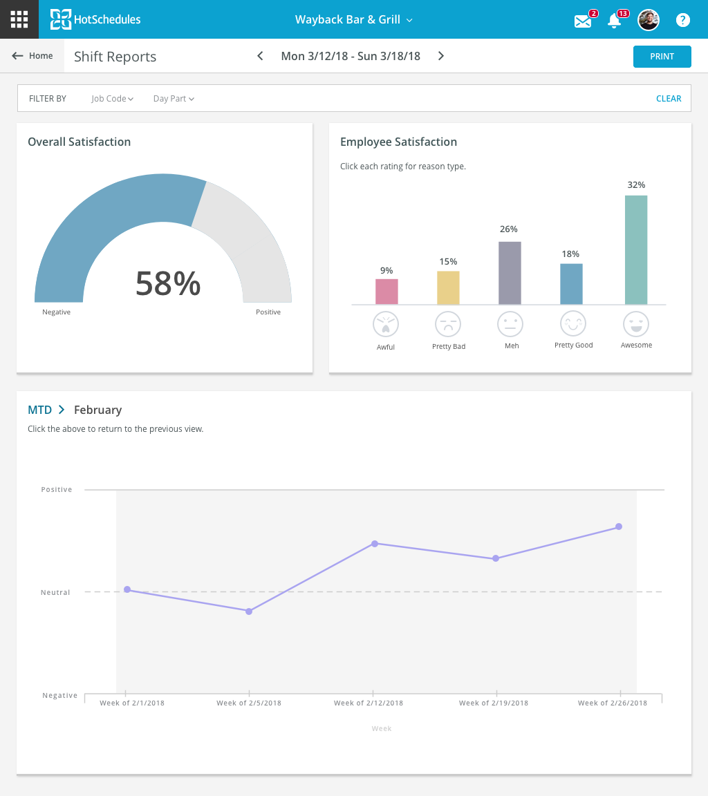
One of the biggest user problems that we were able to solve was data visualization for shift reports.
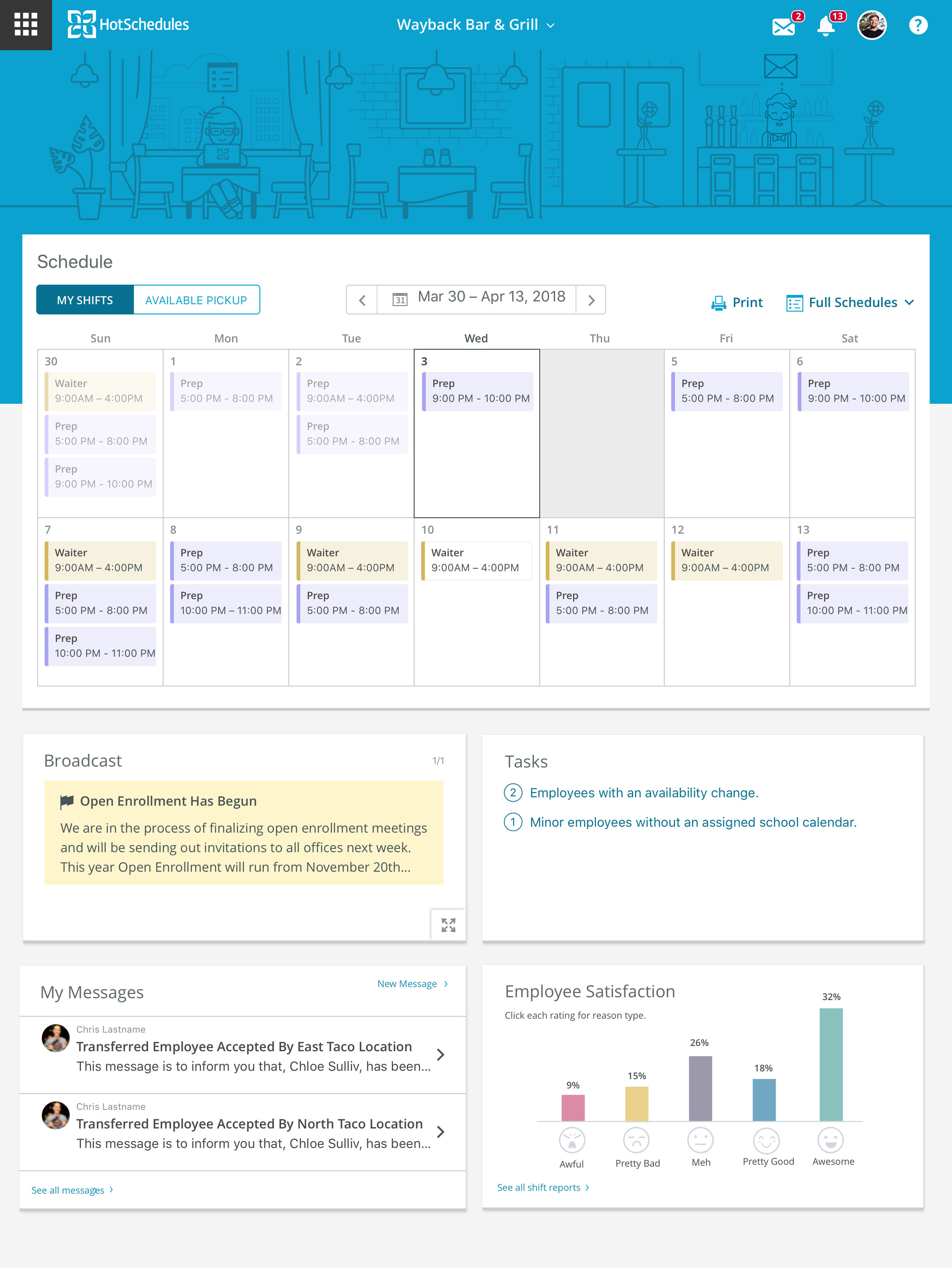
To give a little context: both managers and employees use our scheduling app to pick-up and drop shifts, view their schedule, check messages, look at forecasting, and more. After an employee works their scheduled shift, they are then asked to rate their experience. They’re given questions that look like this:
My task was to find a way to compile and display the data that would generate from this for managers, and in a way that would be useful but still let employees retain anonymity.
BRAINSTORMING
First, I did a lot of preliminary research on data viz and reporting in general, and started an invision board of my findings.
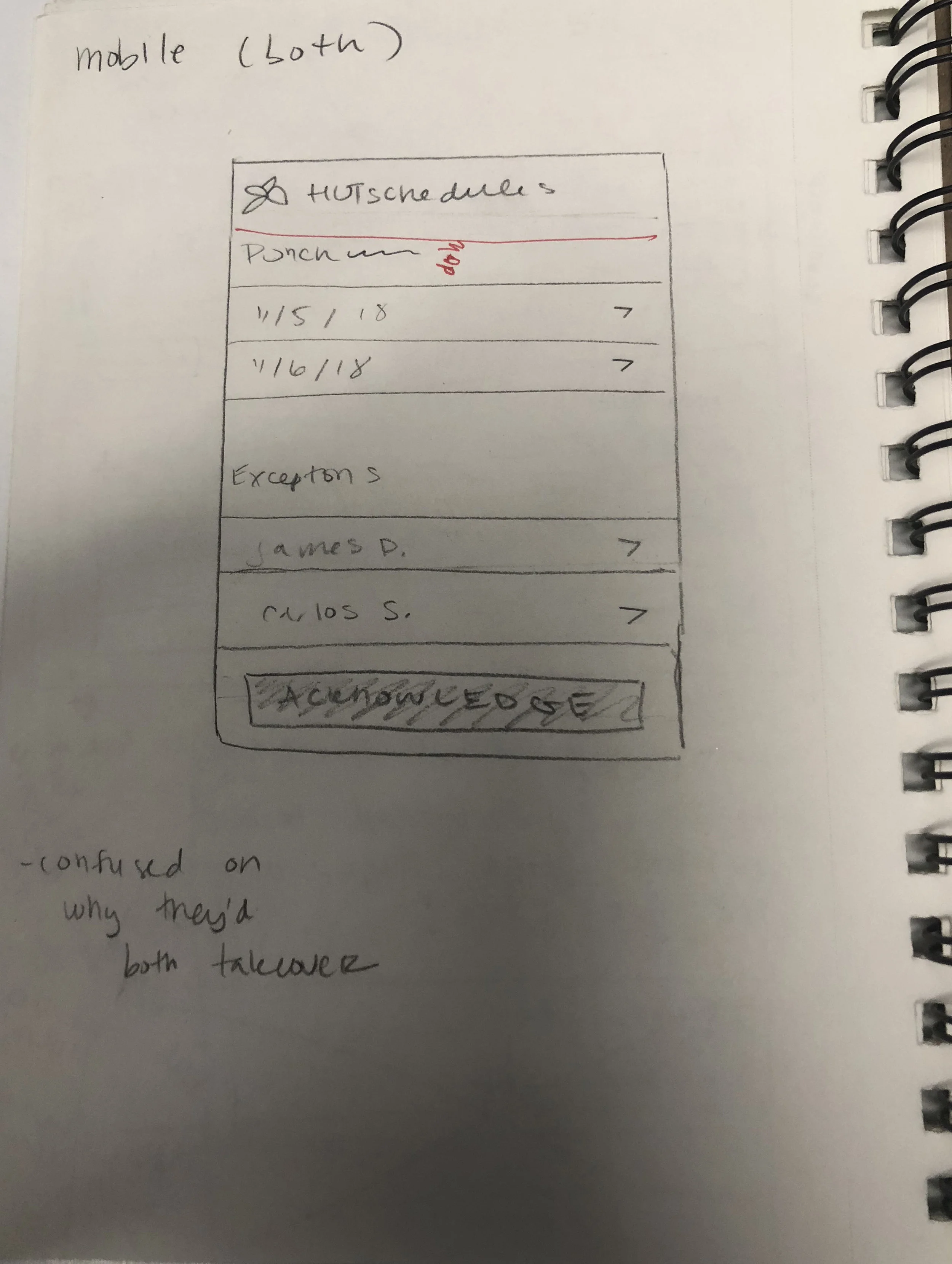
Next, I began ideating with user flows and some sketches to get the process rolling for the general direction I wanted to head towards.
I shared my ideas with our POs and PMs as well as my design leads, and received a lot of helpful feedback and challenges that assisted me in moving forward with the design process.
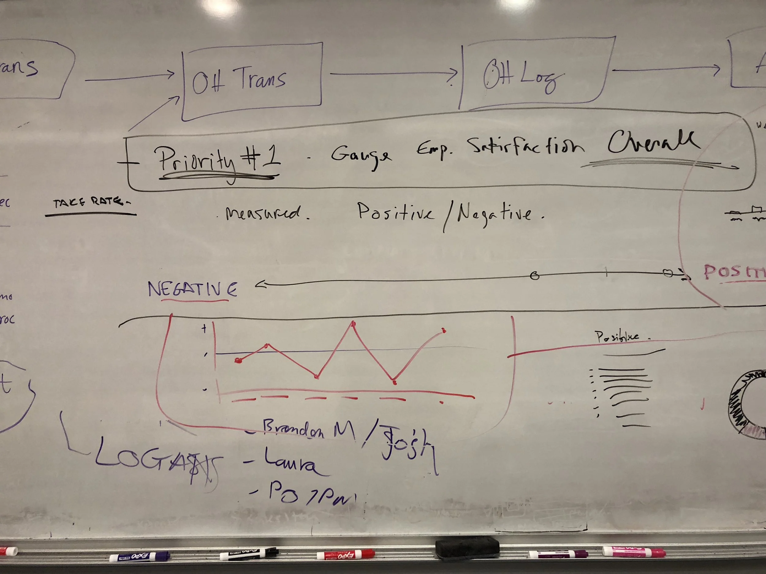
After that, I began whiteboarding with a couple of my fellow designers to really nail down what types of charts would work, and what wouldn’t—to produce a solution that would work for real users.
We defined the problem as trying to find a successful way of gauging overall employee satisfaction.
From here, I began designing some low-fi wireframes.
I shared these designs with the team during a formal design review, took feedback from my peers and seniors, and landed on a chart solution that was most appropriate for our customer base.
Though the original scope called for a singular data viz chart, I wanted to advocate further our users. I decided to devise two more charts that If elt would serve managers better in their experiences for making decisons when scheduling.
I decided on:
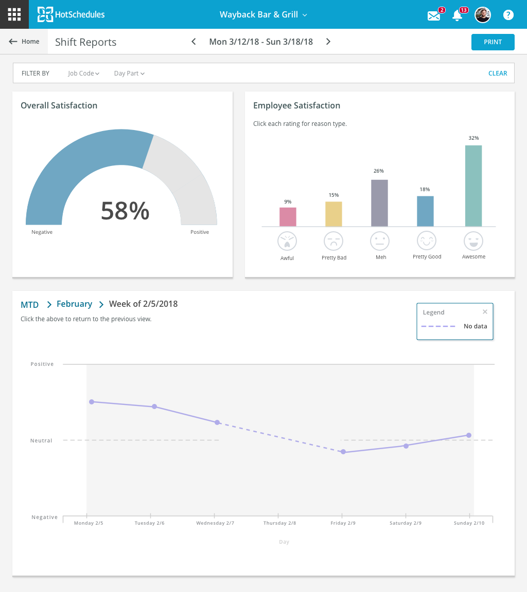
A year-to-date monthly trend chart that could be drilled down further into weekly and daily
An overall positive/negative moving gauge chart
A ratings chart with reason drilldowns
ITERATIONS
Now I was able to start designing some higher fidelity screens. Below are the various iterations:
TESTING
At this point, I wanted to run a user test on the most recent design of the screens. I used our company’s usability hub and created a clickable hot-spot test for a pool of select users.
Screens from my test are below:
The takeaways:
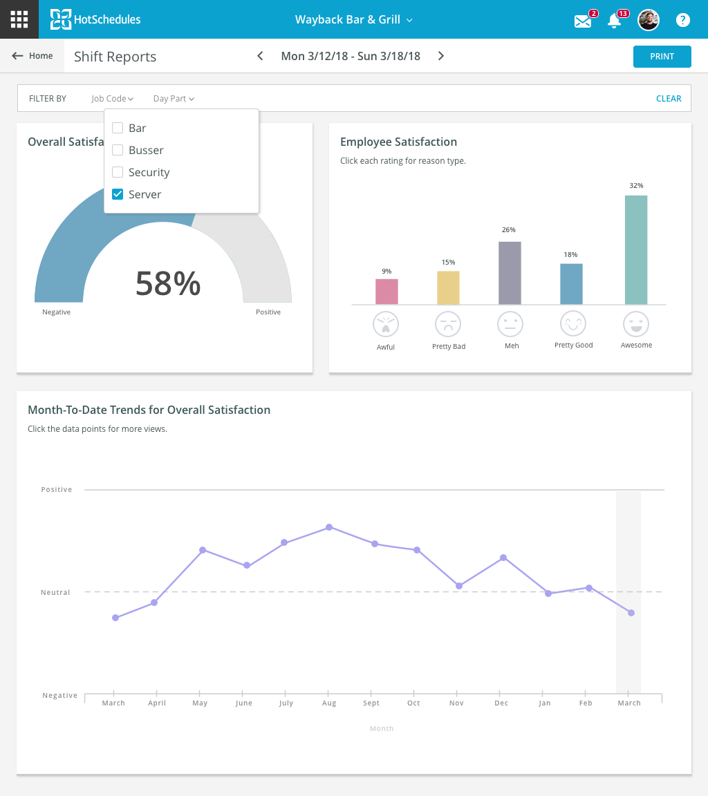
Users easily understood how to filter and sort the charts
Users easily understood how to drill down into a category
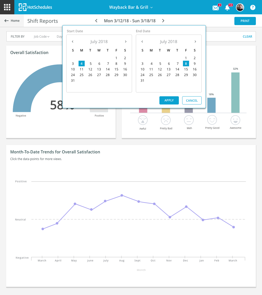
Users could not correlate the date picker at the top with the trend chart at the bottom
Users initially could not understand the importance of the trend chart
Users felt that “meh” was a negative reaction
MOST RECENT SCREENS & HANDOFF
After the testing, I synthesized a lot of what I found and iterated further on my designs. I frequently collaborated with the dev and PMs during this stage, to make sure that the ideas I had could be implemented successfully. After I finished the screens, I handed them off to dev in a clickable prototype in InVision, complete with specs and notes.
Below are the final views I handed off:
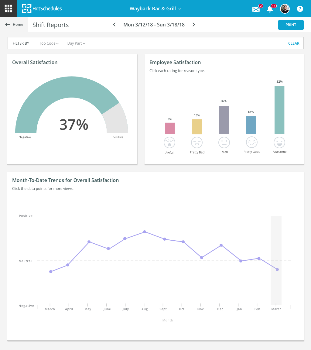
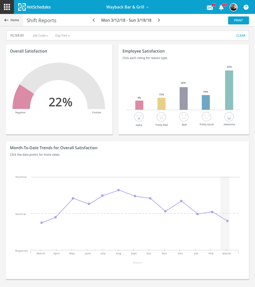
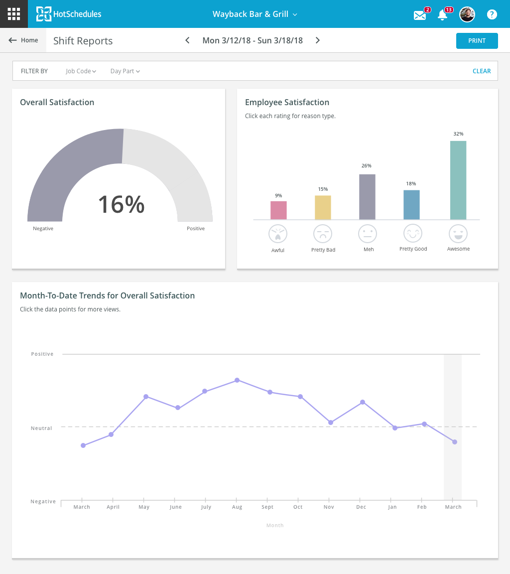
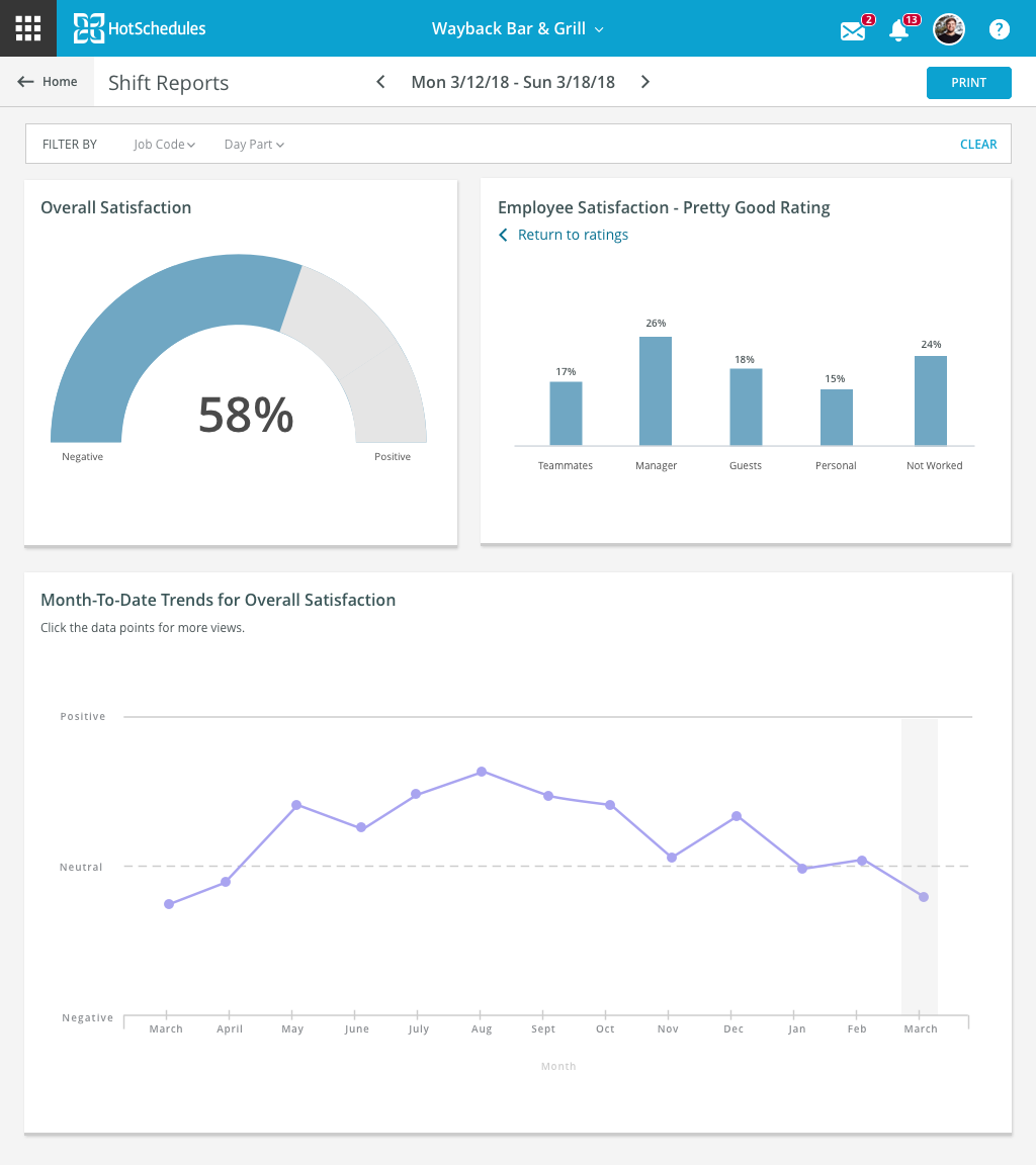
I then updated and completed the JIRA ticket, and finished the project just in time for the sprint to end.
VARIOUS UI/UX WORK
A lot of what I worked on at Hotschedules was delivering fast prototypes and mock-ups of screens that needed a quick UI or UX pass. With these types of projects, I usually only went through the process of grooming with the POs/PMs, sketching and whiteboarding.
One of the most high impact projects consisted of designing the login screen to our software and application, which is now already live at this link:
https://www.hotschedules.com/hs/login.jsp
Here’s what the screens for all the possibilities look like:
I’ve also taken a couple videos of a few more prototypes I designed and handed off to dev:
style guide
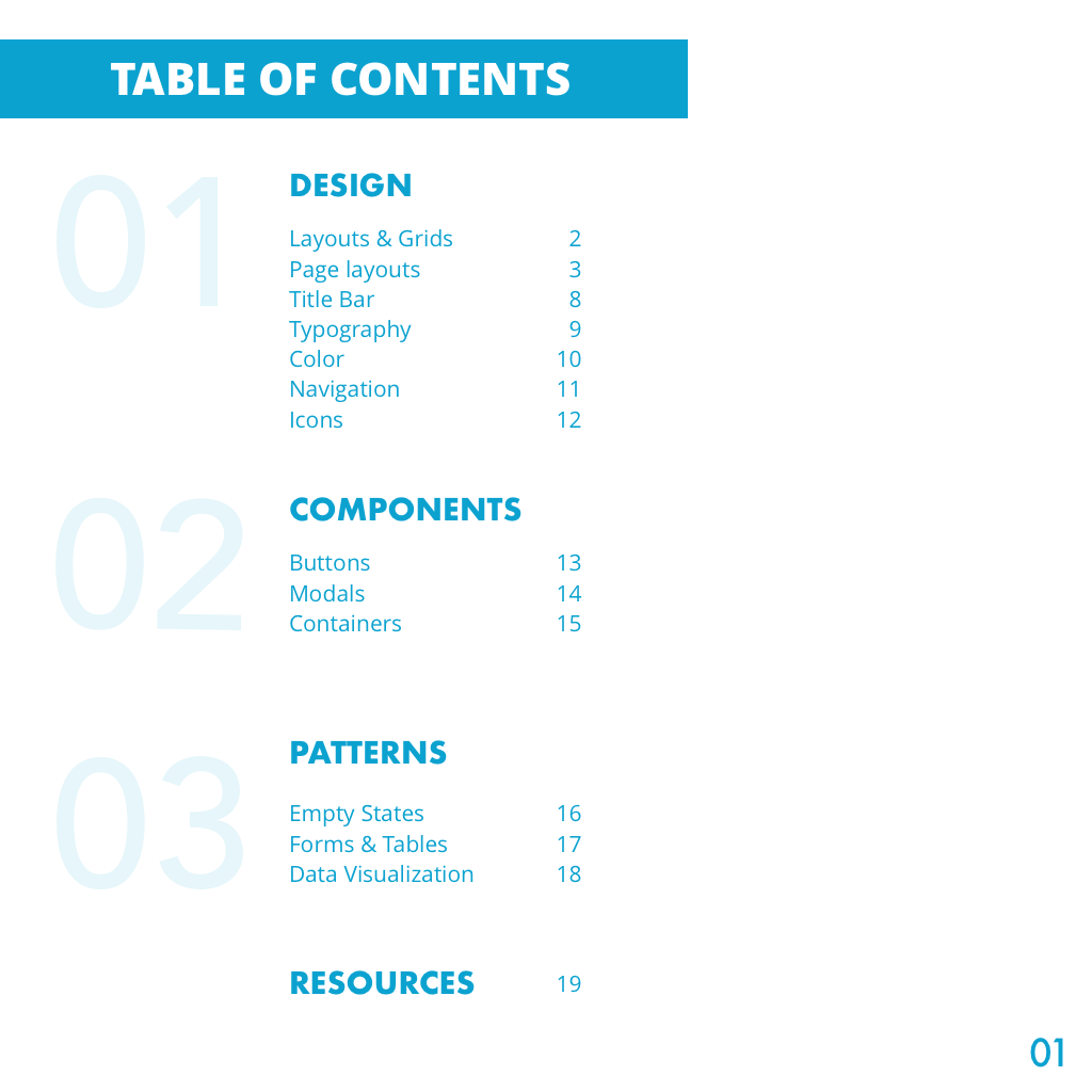
Something else I had the pleasure of owning during my time at Hotschedules was starting a living style guide. I believe this should be a living document because the user needs are constantly changing and we needed to be an adaptable culture. I did not feel that the team had a consistent style guide to work from and this created gaps in our work. I opted to start one, and use it as an authorized guide that the tam could use going forward.
Below is the one that I created that is now serving as the backbone of the guide they will be using going forward:
