C A S E S T U D Y
A LOCAL E-COMMERCE SITE
(Psst. In a hurry? Jump to any part of my design process above!)
THE DESIGN CHALLENGE
Design an e-commerce website for a local Austin business.
THE PROJECT
TOOLS
Sketch, InVision, Illustrator, Balsamiq
DELIVERABLES
Clickable prototype
TEAM
Me!
CLIENT
Old Bakery & Emporium
TARGET DEVICE
E-commerce site
SPRINT DURATION
Two weeks
MY ROLE
stuff i did
- Research the business culture and goals
- Conduct a comparative analysis
- Run user interviews
- Synthesize the data
- Ideate with storyboarding
- Sketch screens and wireframe
- Conduct usability testing
- Create clickable prototype
- Design high-fidelity screen
- Iterate, iterate, iterate
ABOUT THE BUSINESS
The Old Bakery & Emporium is a historic building located in the heart of downtown Austin. A quirky store featuring handmade-goods and specially curated artisan products, local artists keep the store fully stocked.
They also house a Visitor Information Center, Art Gallery and the Lundberg-Maerki Historical Collection. Because of its unique, singular nature, the shop has never yet had an official site to display and sell their wares. Creating this site was my task ahead.
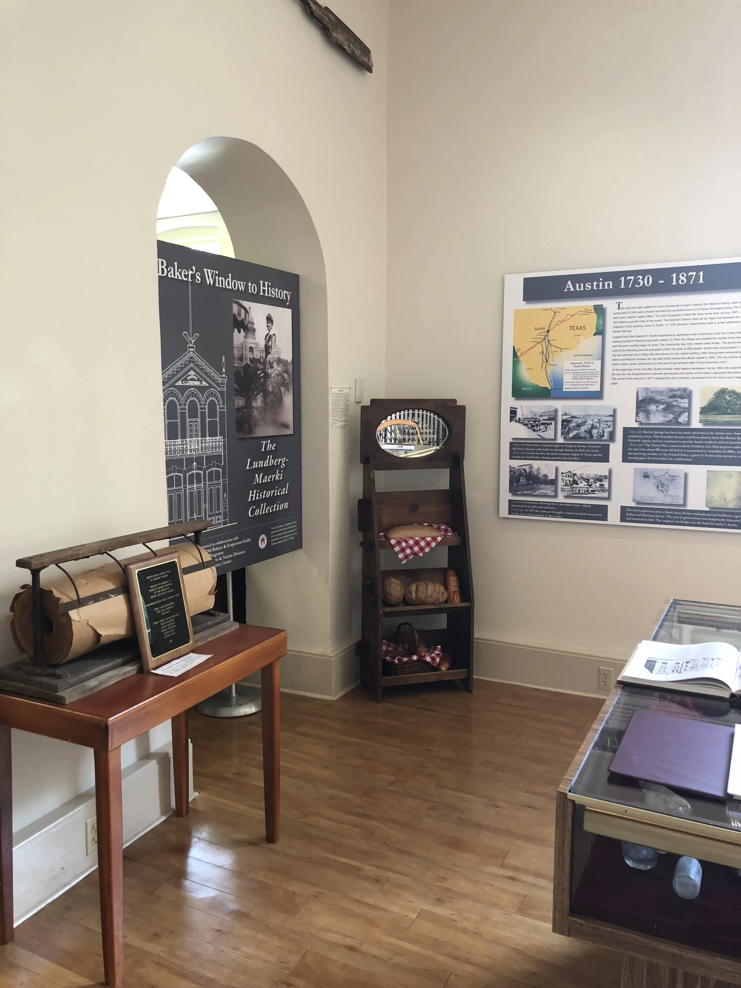
In order to design a site based on a shop, I decided to do the most important thing first: visit the store in person.
Visiting the store allowed me to really explore the type of products that were going to be sold in the shop and gain a general vibe for what direction the design should go. I also got the opportunity to chat with a few employees who imparted some of the store’s rich history with me. Said history was showcased on the third level and gave the shop a new level of charm.
COMPARATIVE ANALYSIS
Before I could move forward with user interviews, I took some time to research the competition and explored some local and online shops for some inpiration and comparison.
TASK ANALYSIS
I then performed a task analysis of each site: find a vase for my mom. Each took about 6-8 steps and gave me some great ideas on how to make my design more effective.
THE TAKEAWAYS
I found that most of the competition has outdated, boring site designs and doesn't offer much in the way of inspiration. The grouping and sorting of products were confusing at times, and (surprisingly) a good chunk of them didn't offer options to checkout with Paypal--a huge paint point!
DISCOVER & DEFINE THROUGH USER RESEARCH
I conducted four interviews with users who all shopped online on at least a semi-regular basis. Through that, I was able to create two personas and thus begin the real first step in the process.
I used various methodologies to organize my user findings into the following categories:
- In-store habits
- Do they abandon shopping carts
- What keeps them from finishing a purchase
- Browsing habits
- Buying preferences
- Shopping wants and desires
- Shipping preferences
- Gift card preferences
- Values and core beliefs
- General shopping habits
- Why they prefer online shopping
- People want more food and entertainment options
Affinity mapping my user interviews takeaways.
INTERVIEW TAKEAWAYS
I spent a full day synthesizing the data from these user interviews: identifying pain points, common desires, probable solutions and preferences.
“I often abandon my shopping cart because i get distracted with other options on the site.”
I found the following trends in my research:
- Users rely on good customer reviews
- Users want 360 and zoom options for viewing products
- Users value a good return policy
- Users would prefer varied shipping options
- Users would be more likely to buy things online over in-store if the business offered exclusives and fast shipping
- Users want a semblance of safety when buying online
CREATING THE PERSONA
I created the primary persona off of the two users who both expressed how working keeps them from shopping locally as much as they would like. I was also able to hear a story about ordering something from etsy and receiving a product that was much smaller and in poorer quality than was promised.
I created the secondary persona off the two users who expressed issues with shipping options and the overall security of local online shops.
THE PROBLEM & SOLUTION
After sorting out the data from the interviews and various heuristic evaluations, I defined the problem as:
A local Austin shop needs an accompanying website that will entice users to shop online in addition to shopping in-store.
And my proposed solution:
I believe I will be able to design a site that will appeal to users who want to shop for artisan goods in a safe and reliable online environment.
USER FLOW: THE HAPPY PATH
From there, I sketched out a happy path that a customer would take when looking to buy a hand-carved bowl and spoon online, and purchasing it.
I used another brain-storming method called mind-mapping to discern even further what options the shopper would want on an e-commerce site.
At this point, I had a pretty good idea of what kind of things to include on the site. So, I then worked on the sitemap.
Storyboarding & SKETCHING
I then took a day to ideate by drawing and storyboarding some potential scenarios and then sketching out low-fi screens of the site.
WIREFRAMING
From there, I further fleshed out my ideas with some medium-fidelity wireframes in Balsamiq. I wire-framed every single screen for the happy path in my user flow, as well as options for signing in, creating an account and viewing the site's history. I also added my own copy and content to give the site some personality and flavor.
I went through four rounds of wireframing in order to finally land on a design I felt satisfied with.
Iterations included experimenting with color, playing around with signed in accounts vs not, updating product pages and adding copy and taglines.
All of the most recent wireframes are in order to view below:
I also developed some potential logos to use on the site, as the business currently had none of these assets to speak of:
I then imported the screens into InVision and was ready to have users test them out!
USABILITY TESTING
I conducted three user testing interviews with a workable prototype. Each offered unique insight into what they thought was missing and how easy it was for them to perform the task that was given to them. I planned on the following scenarios:
- Imagine that you’re looking to buy a hand-carved bowl and spoon
- You want to check out the history behind the shop
- View the prism collection
KEY FINDINGS
- Two users experienced confusion when presented with the word "giftware", they didn't know what was included in that category
- One user would look at new arrivals before checking out categories
- Three users really love the 360 view option
- Two users thought the flow of the site felt natural and familiar
- Three users found the buying process to be simple and intuitive
FURTHER ITERATING & ANNOTATIONS
The test led me to develop and update the most recent wireframes, as well as create a high-fidelity screen to showcase the design direction I brainstormed for the entire site.
Check out the prototype below!
OVERVIEW
I feel accomplished that I designed a site from scratch with no existing assets that provides customers with a safe, reliable shopping experience. I also feel satisfied that I provided advantages to the business by offering local pick-up, a section for its history, and detailed view options for their products.
WHAT WENT WELL
The ideating and research went really well in this project--I lived close to the shop so it was easy to come back multiple times to gauge the vibe and customer base. It was also really fun to come up with the copy for their business and some of their products!
WHAT I LEARNED
Managing my time in an efficient manner was the issue that plagued me the most--there were countless sleepless nights because I went above and beyond the required task by creating logos, copy and more. I need to learn to prioritize what should be done first and spend less time on brainstorming some of the extra fun stuff.
NEXT STEPS
If I continued the project, I’d like to take the following next steps:
- Develop high-fidelity screens for all the wireframes
- Experiment with sorting options
- Social media integration with facebook and instagram


