C A S E S T U D Y

RED DEAD REDEMPTION 2


(Psst. In a hurry? Jump to any part of my design process above!)
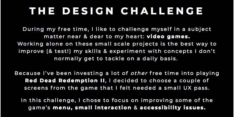
THE PROJECT
TOOLS
Axure, InVision, Illustrator, 99 Post-its
DELIVERABLES
High-fidelity UI screens
TEAM
Just me!
SPEC CLIENT
Rockstar Games
TARGET DEVICE
Playstation 4
SPRINT DURATION
Two weeks
MY ROLE
stuff i did
Play a whole lot of Red Dead
Research accessibility standards in games
Conduct a comparative & competitive analysis
Run user interviews
Synthesize the data
Ideate customer journeys
Sketch screens and wireframe
Conduct usability testing
Create medium fidelity prototype screens
Iterate, iterate, iterate


ABOUT ROCKSTAR & THE RED DEAD FRANCHISE
The publisher behind the studios who brought us series like Max Payne, Grand Theft Auto, LA Noire and, of course, Red Dead, Rockstar Games operates as one of the most successful companies in the world who consistently seek to bring rich, immersive stories to their gameplay experiences.
It comes as no surprise that both installments in the Red Dead franchise are games of the year contenders. A whole lot more than a “Grand Theft Auto with horses”, Red Dead Redemption II follows in the first one’s footsteps, but manages to deliver a game unlike no other—an experience that overshadows its predecessor to almost comedic-like levels.

The staggeringly beautiful, almost unbelievably real landscapes only enhance this emotionally complex, character-driven story. We get to experience the banal, day-to-day activities of the wild west while developing rich, meaningful friendships with side characters and exploring the nuance and complexities of Arthur Morgan. It’s funny, it’s touching, it’s…all-encompassing.
RDR2 is a masterpiece, a living, breathing world that truly feels as if it’s shaped by the player—one could spend an eternity bemoaning how just how dang pretty it actually is.
To put it simply: RDR2 is a once-in-a-lifetime type game, and one that will continue to be so for quite some time.
So naturally, I wanted to see how I could make it even better.
INITIAL THOUGHTS
I first ran a small UX pass on a couple of the screens to gauge current usability.

I then ran a pass on the menu screen itself, as I encountered a few issues while navigating it. At this point, I had a general idea of what areas I wanted to focus on improving but first wanted to conduct some user research to discern trends and paint points other players were experiencing.

DISCOVER & DEFINE THROUGH USER RESEARCH
For me, the user interviews are the bread and butter and the most important part of starting my process. When I’m a user of the product I’m working on, they become even more important so I don’t work in a biased silo.
I decided to conduct some initial polls on social media that would net me a sizable pool of potential users. I ended up recruiting five players with varying gamer demographics and experience playing R2D2.

I came up with about 20 questions to jump-start the conversation and organized my user findings into the following categories:

INTERVIEW TAKEAWAYS
Synthesizing all that juicy data:
“It’s a masterpiece, grappling with extremely complex abstract concepts of the good and bad of change, the simple outlaw life versus the complexity of the modern civilized world, moral and ethical codes, friendship, betrayal…I could wax lyrical about the depth of story for hours”
I discovered many trends from the user interviews that I’ve broken down into the following takeaways:
Players love that RDR2 rewards random exploration
4 out of 5 players played and loved the first Red Dead
3 out of 5 players have beat the game at 100% completion
Players feel that the weapon system is outdated & not intuitive
Players love that the game utilizes items like Arthur’s journal to portray emotional depth and character
3 out of 5 players believe the game could improve its accessibility
Players think the compass is distracting and hard to read
Most players were initially confused by menu UIs
All players widely use the camera and screenshot option
Players believe some of the micro-interactions with in-game objects could use some work
All players believe the strongest part of the game is the story
Players believe that the game’s insistence on realism can be frustrating and detract from spending more time in the game
3 out of 5 players have tried the online beta
Players get frustrated with online beta’s mechanics
Players enjoy how realistic and satisfying the hunting and fishing system is
“Sometimes you just wanna say “Howdy, Mister!” but you end up beating up a pedestrian in Saint Denis and attain a wanted level and have to kill and/or maim some lawmen”
Overall, players enjoyed the game’s deep, astounding narrative plot and its incomparable visuals. Besides some small frustrations with a few of the micro-interactions (ie, having Arthur attempt to grab a Kentucky Bourbon that takes a bit too long), the main trend that I’ve zeroed in on was the fact that the game exhibits a few accessibility, UI, and micro-interaction issues that need improvement.
COMPARATIVE ANALYSIS
I decided to dig further into to my research by exploring two other games that I’ve loved playing: Horizon Zero Dawn and Skyrim.

Through this I was able to glean that, though RDR2 is ahead of its counterparts by leaps and bounds story-wise, it could learn a thing or two in navigation areas. Horizon Zero Dawn does a phenomenal job of showing just how great removing UI elements ends up increasing player immersion in the game.
No HUD exists on the screen besides an objective marker that tells a player how far away an active quest is: if their health is fine, they won’t see any health bars. If they aren’t using a weapon, they won’t see anything regarding it. It’s simple.

Horizon Zero Dawn’s HUD is almost completely removed in gameplay.
Similarly, Skyrim has a beautiful way of incorporating navigation into its interface by just utilizing a compass at the top of the screen in lieu of a minimap. It’s clear and easy to read, and lets the player feel like they can explore without having to rely on indecipherable markers on an always-present map.

Skyrim’s navigational compass is sleek and elegant, & doesn’t distract from gameplay.
I then researched a few menu screens from games that sported both a strong story and online/multiplayer mode for some inspiration and comparison. Here are a few from Far Cry 5, Mass Effect 3, Call of Duty Black Ops 4, and another from Horizon Zero Dawn.


CUSTOMER JOURNEY: CREATING THE PERSONA
At this point, I was almost ready to start creating my persona. Before I could finalize that, I opted to utilize the interview data even further by mapping out a potential player flow/journey. This allowed me to identify more trends and pain points our user experiences while accessing the weapon wheel, traveling, and using the various in-game menus.

Now I could finally create a real persona that would benefit the most from the areas I was seeking to improve: meet Aiden, a 31-year old account manager from Texas who plays games 3-4 times per week.

FEATURE PRIORITIZATION
Next, I decided to brainstorm a bit on what kind of features I wanted to focus on. This would help aid me in truly defining the problem I wanted solve.

I organized all my potential ideas using the Must-Have, Should-Have, Could-Have and Won’t-Have method (MoSCOW) and after much deliberation, decided on three final ones to start with.
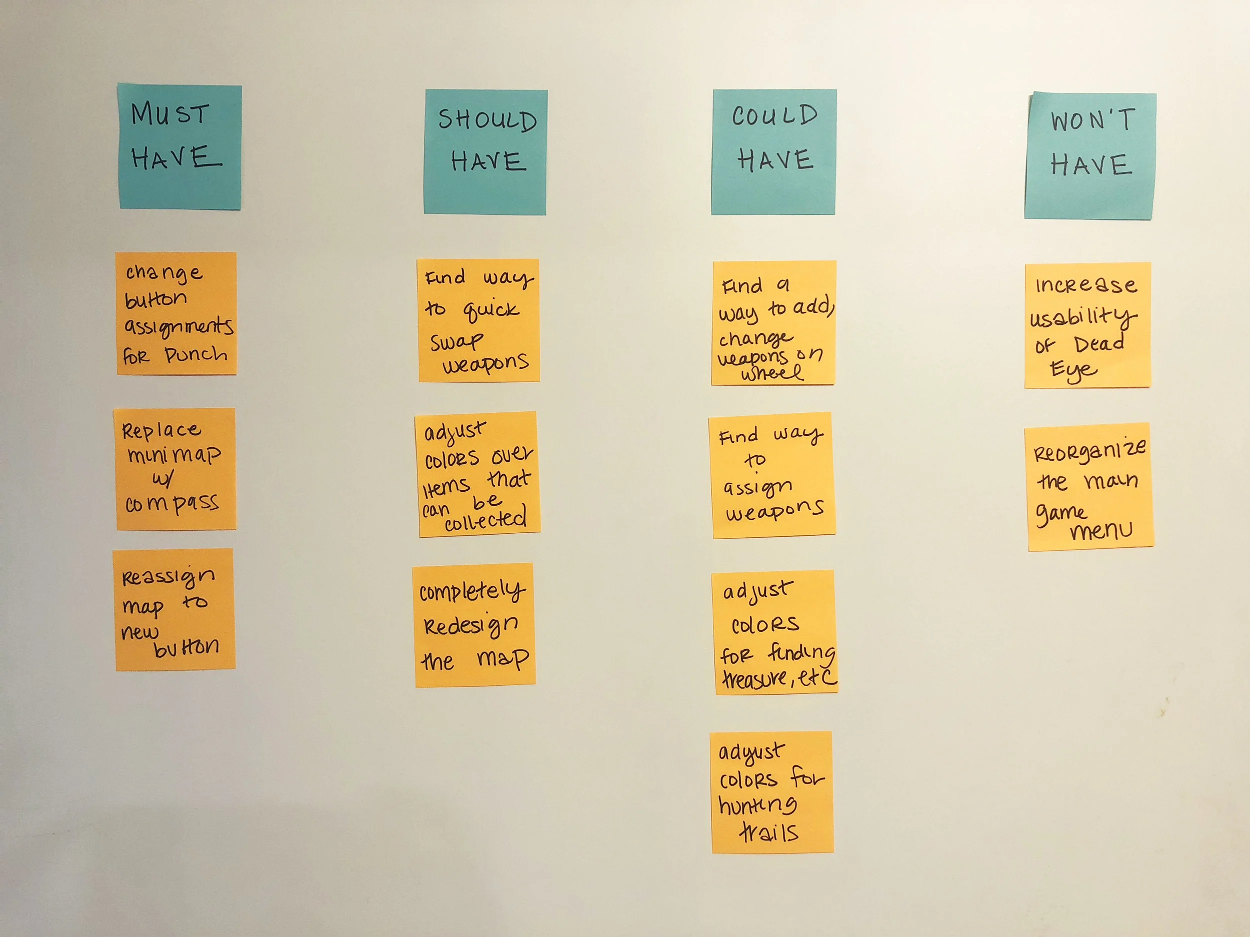
I used the MoSCOW method to prioritize what features I should focus on improving.
THE PROBLEM & SOLUTION
I was finally ready to define the problem I wanted to solve:
Players have a difficult time interacting with the main menu, the minimap’s HUD and deciphering icons on the map as a whole. Additionally, players incorrectly use the weapon assignments which can hinder successful gameplay progression.
My proposed solution? Well, besides wanting to completely redesign the main map (authenticity should be scrapped for accessibility), I’ve decided on the following:
Remove the minimap and replace with a sleek compass
Rearrange the items on the main pause menu
Adjust button assignments for both the map and weapon wheel
And if I have time:
Adjust the colors for hunting trails and items that can be collected.

USER FLOWS
I began ideating with my potential solutions with a couple of user flows.
User Flow #1: Use new compass feature.

User Flow #2: Take out an AI without accidentally murdering him.

SKETCHING & WIREFRAMING
I then began sketching out ideas and drew ones that I didn’t necessarily include in my user flows or my final decision, like making more slots for weapons on the wheel, moving around text callouts and the health/mana icons, and reorganizing the main menu.


WIREFRAMING
Now that I had a general idea for what kinds of screens I wanted to tackle and the direction I wanted to go, I started some low-fidelity wireframing.
Below are new ideas for updating the main menu and a couple more screens for what things are now going to be grouped together.


Next, I designed two screens based on the new melee system I wanted to explore as well as another updating the weapon wheel screen.

Lastly, and most importantly, I replaced the minimap with a compass located at the top of the screen. I included options for both having the health/mana status on and off.


USABILITY TESTING
I then used the above wireframes to conduct user tests with three different users, all of whom were part of the initial pool of potential users I had recruited earlier on. Below are some examples of questions and tasks I asked each user:
How would you access the radar and map HUD in this version?
Would you use this compass over the one available in-game already? Why or why not?
Would you want to pull up a moves list during a melee fight?
How many times would you now want to melee over using just a gun with these changes?
KEY FINDINGS
All players preferred option one with the menu order
Two users suggested moving “settings” up higher on the list since it is a highly used menu
One user liked that the “player” category merged, but suggested that the name “progress” be changed to something more fitting and reflective
All users were in favor of updating the color affordance for items
Two users did not like the melee option showing during a fight
Two users did not want to remove the minimap, but liked that the compass designed would replace the one included in the game
One user did not want to add more items to the weapon wheel because it would make them “harder to see”
One user suggested reorganizing the items completely
One user loved the compass and would use that instead of the minimap
All users liked that the melee option was assigned to the “attack” key
FURTHER ITERATING
The user tests challenged a lot of my original ideas which led me to scrapping some of my old designs and redoing a few others. I opted to table the idea of adding more weapons to the weapon wheel, and decided to focus three minor interactions for now.
Below are the higher fidelity screens of my latest decisions based on their feedback.
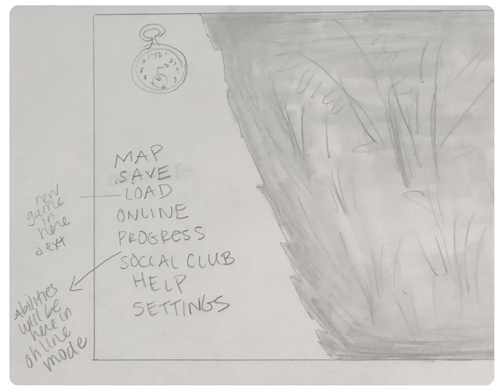
THE MENU:


The changes I’ve made include:
Reorganized the order of menu titles
Changed the name of “progress” to “records”
Removed the “player” menu and added it to “records”
Removed the “story” option and added “save” and “load”
“Load” menu now leads you to a menu with that & new & exit game
“Records” now has all of what “progress” had plus Arthur & horse
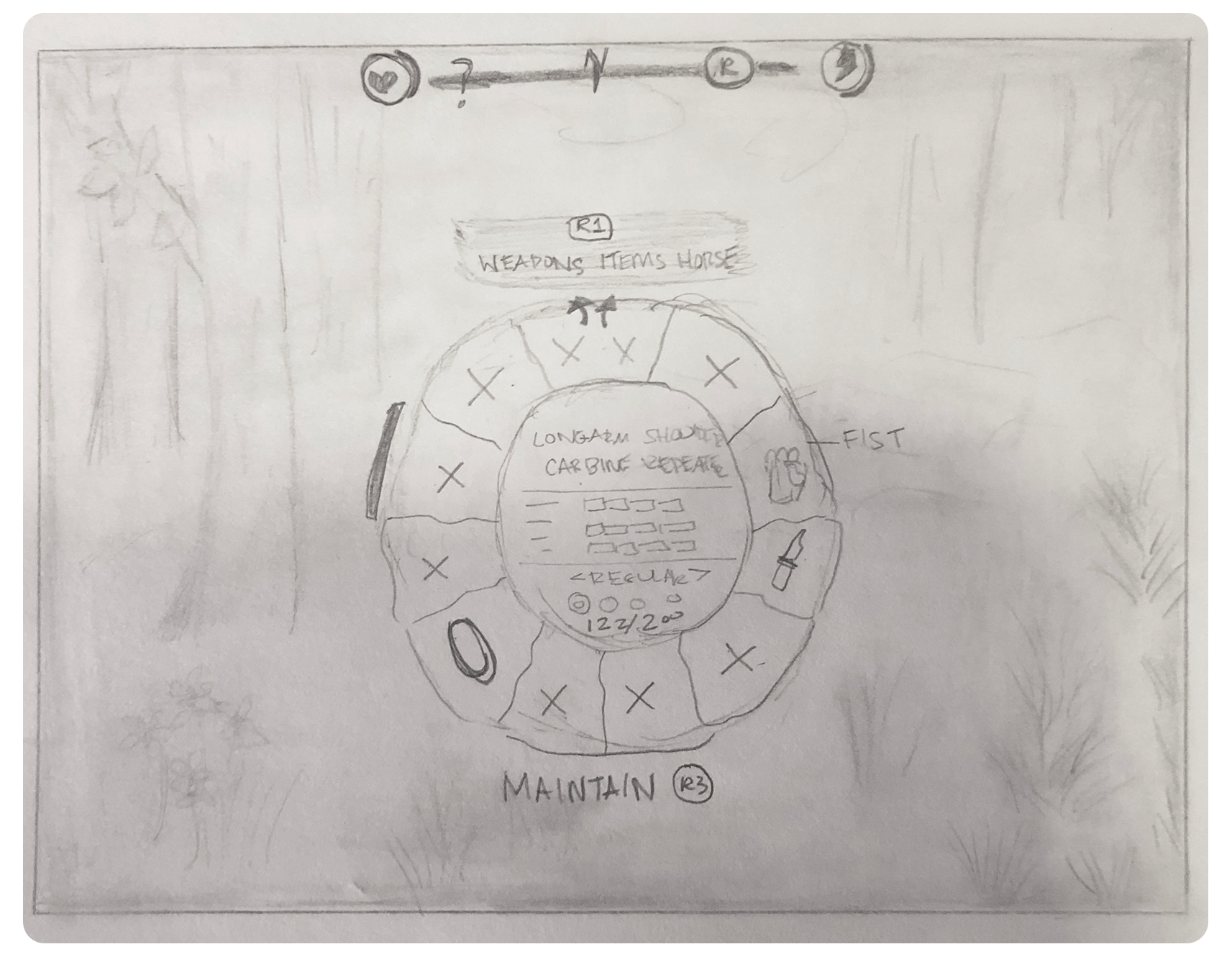
THE WEAPON WHEEL & MELEE
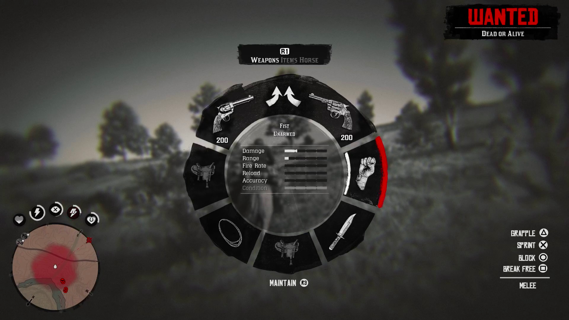
Updates to this screen:
Moved the location of “maintain” to just under the wheel
When a user selects “fist”, it brings up the menu for melee moves
Using the attack “R2” trigger with fists selected (and when you don’t have a gun in your hand) now lets you attack without accidentally shooting someone
THE COMPASS

Updates to this screen:
Replaced the game’s compass with this new design
Made new locations for the health/mana status for Arthur and his horse
There still lies an option for switching to a minimap, expanded minimap, and removing the HUD altogether
I ALSO ASSIGNED NEW COLOR AFFORDANCES TO THE ITEMS IN THE SATCHEL & WHEEL:


OVERVIEW
This was a huge undertaking—I thought focusing on the smaller interactions wouldn’t require much time, but I quickly learned that I was mistaken! Every small micro-interaction I considered changing held a lot of consequences and domino-like effect in the overall experience.
I wanted to focus on improving the player’s experience interacting with the main pause menu and I feel I successfully accomplished this with the proposed solution. I also wanted to improve the accessibility both in the weapon wheel and the satchel, and assigning varying color affordances I believe will achieve this. In the future, I’d like to explore alternate color options to account for color-blindness.
Taking all of my user feedback into consideration, I wanted to highlight how simple things like using the same color assignments can confuse players, or how letting a player draw a type of weapon inconsistently can cause immense frustration. I also wanted to show how adding an option for a compass that looks and feels more like the ones players are used to (and like better) can incentivize players into exploring and admiring the beautiful world they’re engaged in.
If I had more time, I’d like to devote a good chunk of it to exploring a better design for the map. I love the western, authentic aesthetic but lots of players have a hard time understanding and deciphering the icons from each other. There’s a lot to be learned here, and I’d love to be able to tackle that direction one day. I’d also like to really dig into looking at different avenues for improving the accessibility of the hunting trails and items you can collect.
Until then, don’t forget to “Be loyal to what matters.”

